Intro
Some of my colleagues had used Influxdb and Grafana at their previous job so they thought it might fit for what we’re doing in the Visibility team. It sounded good in theory, anyway, so I had to agree. There were a lot of pitfalls. Eventually I got it to the point where I’m satisfied with my accomplishments and want to document the hurdles I’ve overcome.
So as time permits I will be fleshing this out.
Grafana
I’m going to lead with the picture and then the explanation makes a lot more sense.
I’ve spent the bulk of my time wrestling with Grafana. Actually it looks like a pretty capable tool. It’s mostly just understanding how to make it do what you are dreaming about. Our installed version currently is 9.2.1.
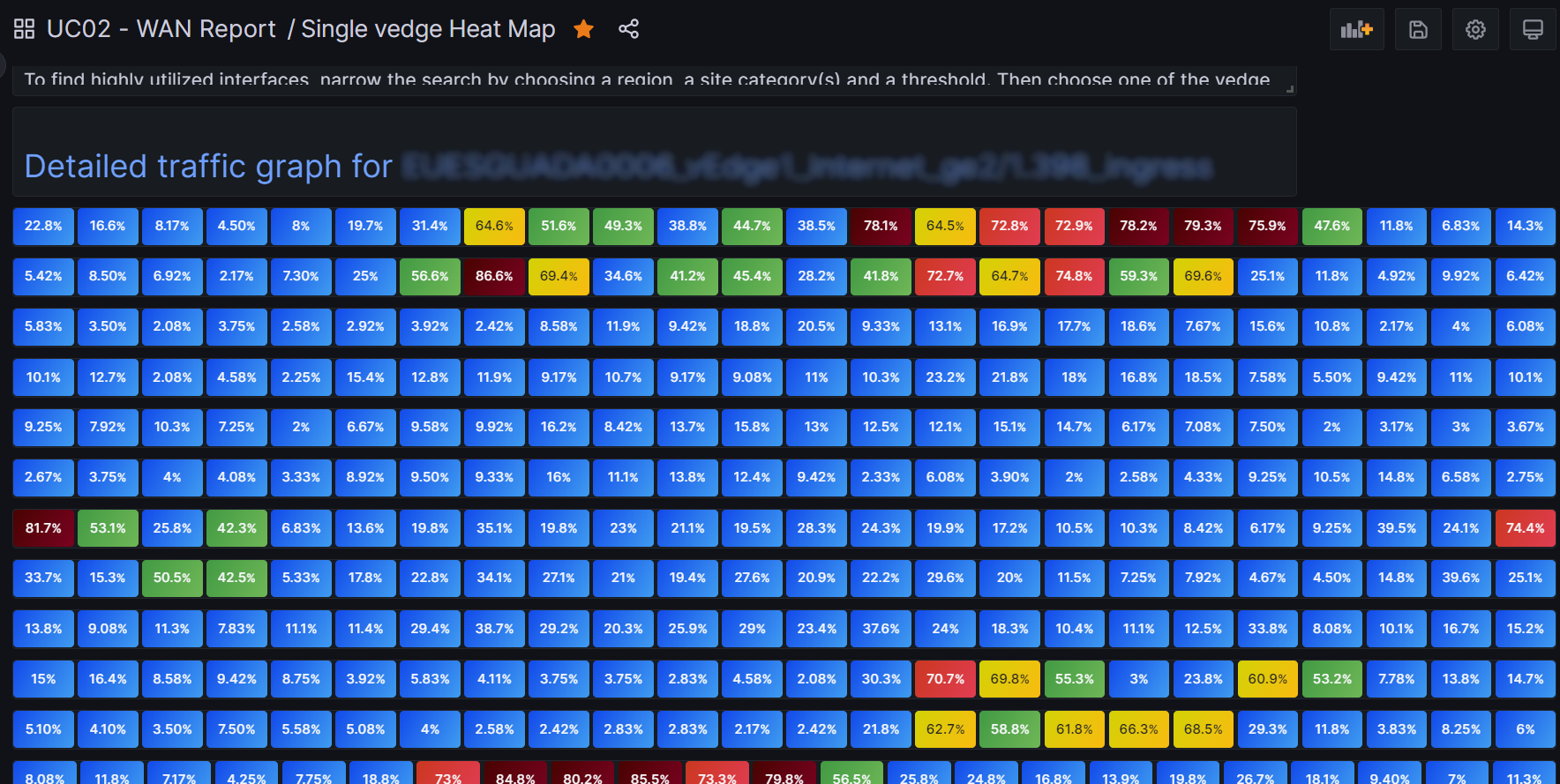
My goal is to make a heatmap. But a special kind similar to what I saw the network provider has. That would namely entail one vedge per row, and one column per hour, hence, 24 columns in total. A vedge is a kind of SD-Wan router. I want to help the networking group look at hundreds of them at a time. So that’s on potential dashboard. It would give a view of a day. Another dashboard would show just one router with the each row representing a day, and the columns again showing an hour. Also a heatmap. The multi-vedge dashboard should link to the individual dashboard, ideally. In the end I pulled it off. I am also responsible for feeding the raw data into Influxdb and hence also for the table design.
Getting a workable table design was really imporant. I tried to design it in a vacuum, but that only partially worked. So I revised, adding tags and fields as I felt I needed to, while being mindful of not blowing up the cardinality. I am now using these two tables, sorry, measurements.
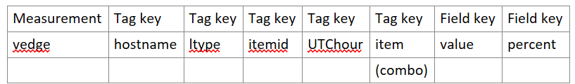
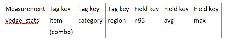
Although there are hundreds of vedges, some of my tags are redundant, so don’t get overly worried about my high cardinality. UTChour is yes a total kludge – not the “right” way to do things. But I’m still learning and it was simpler in my mind. item in the first measurement is redundant with itemid. But it is more user-friendly: a human-readable name.
Influx Query Explorer
It’s very helpful to use the Explorer, but the synatx there is not exactly the same as it will be when you define template variables. Go figure.
Multiple vedges for the last day
So how did I do it in the end?
Mastering template variables is really key here. I have a drop-down selection for region. In Grafana-world it is a custom variable with potential values EU,NA,SA,AP. That’s pretty easy. I also have a threshold variable, with possible values: 0,20,40,60,80,90,95. And a math variable with values n95,avg,max. More recently I’ve added a threshold_max and a math_days variable.
It gets more interesting however, I promise. I have a category variable which is of type query:
from(bucket: "poc_bucket2")
|> range (start: -1d)
|> filter(fn:(r) => r._measurement == "vedge_stats")
|> group()
|> distinct(column: "category")
The distinct function eliminates rows with identical values. This can be useful for creating an iterator!
Multi-value and Include all options are checked. Just to make it meaningful, category is assigned by the WAN provider and has values such as Gold, Silver, Bronze.
And it gets still more interesting because the last variable depends on the earlier ones, hence we are using chained variables. The last variable, item, is defined thusly:
from(bucket: "poc_bucket2")
|> range (start: -${math_days}d)
|> filter(fn:(r) => r._measurement == "vedge_stats" and r.region == "${Region}")
|> filter(fn:(r) => contains(value: r.category, set: ${category:json}))
|> filter(fn:(r) => r._field == "${math}" and r._value >= ${threshold} and r._value <= ${threshold_max})
|> group()
|> distinct(column: "item")
So what it is designed to do is to generate a list of all the items, which in reality are particular interfaces of the vedges, into a drop-down list.
Note that I want the user to be able to select multiple categories. It’s not well-documented how to chain such a variable, so note the use of contains and set in that one filter function.
And note the double-quotes around ${Region}, another chained variable. You need those double-quotes! It kind of threw me because in Explorer I believe you may not need them.
And all that would be simply nice if we didn’t somehow incorporate these template variables into our panels. I use the Stat visualization. So you’ll get one stat per series. That’s why I artifically created a tag UTChour, so I could easily get a unique stat box for each hour.
The stat visualization flux Query
Here it is…
data = from(bucket: "poc_bucket2")
  |> range(start: -24h, stop: now())
  |> filter(fn: (r) =>
    r._measurement == "vedge" and
    r._field == "percent" and r.hostname =~ /^${Region}/ and r.item == "${item}"
  )
  |> drop(columns: ["itemid","ltype","hostname"])
data
Note I hae dropped my extra tags and such which I do not wish to appear during a mouseover.
Remember our regions can be one of AP,EU,NA or SA? Well the hostnames assigned to each vedge start with the two letters of its region of location. Hence the regular explression matching works there to restrict consideration to just the vedges in the selected region.
We are almost done.
Making it a heat map
So my measurement has a tag called percent, which is the percent of available bandwidth that is being used. So I created color-based thresholds:
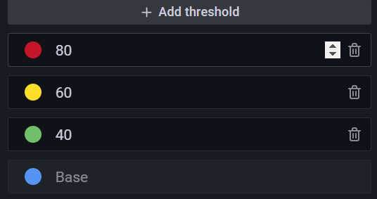
You can imagine how colorful the dashboard gets as you ratchet up the threshold template variable. So the use of these thresholds is what turns our stat squares into a true heatmap.
Heatmap visualization
I found the actual heatmap visualization useless for my purposes, by the way!
There is also an unsupported heatmap plugin for Grafana which simply doesn’t work. Hence my roll-your-own approach.
Repetition
How do we get a panel row per vedge? The stat visualization has a feature called Repeat Options. So you repeat by variable. The variable selected is item. Remember that item came from our very last template variable. Repeat direction is Vertical.
For calculation I choose mean. Layout orienttion is Vertical.
The visualization title is also variable-driven. It is ${item} .
The panels are long and thin. Like maybe two units high? – one unit for the label (the item) and the one below it for the 24 horizontal stat boxes.
Put it all together and voila, it works and it’s cool and interactive and fast!
Single vedge heatmap data over multiple days
Of course this is very similar to the multiple vedge dashboard. But now we’re drilling down into a single vedge to look at its usage over a period of time, such as the last two weeks.
Flux query
import "date"
b = date.add(d: 1d, to: -${day}d)
data = from(bucket: "poc_bucket2")
  |> range(start: -${day}d, stop: b)
  |> filter(fn: (r) =>
    r._measurement == "vedge" and
    r._field == "percent" and
    r.item == "$item"
  )
  |> drop(columns:["itemid","ltype","hostname"])
data
Variables
As before we have a threshold, Region and category variable with category derived from the same flux query shown above. A new variable is day, which is custom and hidden, It has values 1,2,3,4,…,14. I don’t know how to do a loop in flux or I might have opted a more elegant method to specify the last 14 days.
I did the item variable query a little different, but I think it’s mostly an alternate and could have been the same:
from(bucket: "poc_bucket2")
|> range (start: -${math_days}d)
|> filter(fn:(r) => r._measurement == "vedge_stats" and r.region == "${Region}")
|> filter(fn:(r) => contains(value: r.category, set: ${category:json}))
|> filter(fn:(r) => r._field == "${math}" and r._value >= ${threshold} and r._value <= ${threshold_max})
|> group()
|> distinct(column: "item")
Notice the slightly different handling of Region. And those double-quotes are important, as I learned from the school of hard knocks!
The flux query in the panel is of course different. It looks like this:
import "date"
b = date.add(d: 1d, to: -${day}d)
data = from(bucket: "poc_bucket2")
  |> range(start: -${day}d, stop: b)
  |> filter(fn: (r) =>
    r._measurement == "vedge" and
    r._field == "percent" and
    r.item == "$item"
  )
  |> drop(columns:["itemid","ltype","hostname"])
data
So we’re doing some date arithmetic so we can get panel strips, one per day. These panels are long and thin, same as before, but I omitted the title since it’s all the same vedge.
The repeat options are repeat by variable day, repeat direction Vertical as in the other dashboard. The visualization is Stat, as in the other dashboard.
And that’s about it! Here the idea is that you play with the independent variables such as Region and threshold, it generates a list of matching vedge interfaces and you pick one from the drop-down list.
Linking the multiple vedge dashboard to the single vedge history dashboard
Of course the more interactive you make these things the cooler it becomes, right? I was excited to be able to link these two dashboards together in a sensible way.
In the panel config you have Data links. I found this link works:
https://drjohns.com:3000/d/1MqpjD24k/single-vedge-usage-history?orgId=1&var-threshold=60&var-math=n95&${item:queryparam}
So to generalize since most of the URL is specific to my implementation, both dashboards utilize the item variable. I basically discovered the URL for a single vedge dashboard and dissected it and parameterized the item, getting the syntax right with a little Internet research.
So the net effect is that when you hover over any of the vedge panels in the multi-vedge dashboard, you can click on that vedge and pull up – in a new tab in my case – the individual vedge usage history. It’s pretty awesome.
Passing the start and stop time range in the link
I didn’t need it for this one, but in another project I wanted the user to use time selection and then be able to get details where their time seleection was preserved. So… I found that adding these additional variables to the link did the job:
&from=${__from}&to=${__to}
It’s a little ugly because the time no longer displays as last 24 hours, for instance. But oh well…
Influxdb
Influxdb is a time series database. It takes some getting used to. Here is my cheat sheet which I like to refer to.
- A bucket is named location with retention policy where time-series data is stored.
- A series is a logical grouping of data defined by shared measurement, tag and field.
- A measurement is similar to an SQL database table.
- A tag is similar to indexed columns in an SQL database.
- A field is similar to unindexed columns in an SQL database.
- A point is similar to SQL row.
This is not going to make a lot of sense to anyone who isn’t Dr John. But I’m sure I’ll be referring to this section for a How I did this reminder.
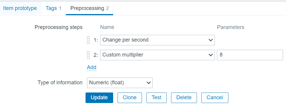
OK. So I wrote a feed_influxdb.py script which runs every 12 minutes in an Azure DevOps pipeline. It extracts the relevant vedge data from Zabbix using the Zabbix api and puts it into my influxdb measurement vedge whose definition I have shown above. I would say the code is fairly generic, except that it relies on the existence of a master file which contains all the relevant static data about the vedges such as their interface names, Zabbix itemids, and their maximum bandwidth (we called it zabbixSpeed). You could pretty much deduce the format of this master file by reverse-engineering this script. So anyway here is feed_influxdb.py.
from pyzabbix import ZabbixAPI
import requests, json, sys, os, re
import time,datetime
from time import sleep
from influxdb_client import InfluxDBClient, Point, WritePrecision
from influxdb_client.client.write_api import SYNCHRONOUS
from modules import aux_modules,influx_modules

# we need to get data out of Zabbix
inventory_file = 'prod.config.visibility_dashboard_reporting.json'
#inventory_file = 'inv-w-bw.json' # this is a modified version of the above and includes Zabbix bandwidth for most ports
# Login Zabbix API - use hidden variable to this pipeline
token_zabbix = os.environ['ZABBIX_AUTH_TOKEN']
url_zabbix = 'https://zabbix.drjohns.com/'
zapi = ZabbixAPI(url_zabbix)
zapi.login(api_token=token_zabbix)
# Load inventory file
with open(inventory_file) as inventory_file:
    inventory_json = json.load(inventory_file)
# Time range which want to get data (unixtimestamp)
inventory_s = json.dumps(inventory_json)
inventory_d = json.loads(inventory_s)
time_till = int(time.mktime(datetime.datetime.now().timetuple()))
time_from = int(time_till - 780)  # about 12 minutes plus an extra minute to reflect start delay, etc
i=0
max_items = 200
item_l = []
itemid_to_vedge,itemid_to_ltype,itemid_to_bw,itemid_to_itemname = {},{},{},{}
gmtOffset_d = {}
for SSID in inventory_d:
    print('SSID',SSID)
    hostname_d = inventory_d[SSID]['hostname']
    gmtOffset = aux_modules.gmtOffset_calc(inventory_d[SSID])
    gmtOffset_d[SSID] = gmtOffset
    for vedge_s in hostname_d:
        print('vedge_s',vedge_s,flush=True)
        items_l = hostname_d[vedge_s]
        for item_d in items_l:
            print('item_d',item_d,flush=True)
            itemname = item_d['itemname']
            if not 'lineType' in item_d: continue # probably SNMP availability or something of no interest to us
            lineType = item_d['lineType']
            if 'zabbixSpeed' in item_d:
                bandwidth = int(item_d['zabbixSpeed'])
            else:
                bandwidth = 0
            itemid = item_d['itemid']
            if lineType == 'MPLS' or lineType == 'Internet':
                i = i + 1
                itemid_to_vedge[itemid] = vedge_s # we need this b.c. Zabbix only returns itemid
                itemid_to_ltype[itemid] = lineType # This info is nice to see
                itemid_to_bw[itemid] = bandwidth # So we can get percentage used
                itemid_to_itemname[itemid] = itemname # So we can get percentage used
                item_l.append(itemid)
                if i > max_items:
                    print('item_l',item_l,flush=True)
                    params = {'itemids':item_l,'time_from':time_from,'time_till':time_till,'history':0,'limit':500000}
                    print('params',params)
                    res_d = zapi.do_request('history.get',params)
                    #print('res_d',res_d)
                    #exit()
                    print('After call to zapi.do_request')
                    result_l = res_d['result']
                    Pts = aux_modules.zabbix_to_pts(result_l,itemid_to_vedge,itemid_to_ltype,itemid_to_bw,itemid_to_itemname)
                    for Pt in Pts:
                        print('Pt',Pt,flush=True)
                        # DEBUGGING!!! Normally call to data_entry is outside of this loop!!
                        #influx_modules.data_entry([Pt])
                    influx_modules.data_entry(Pts,gmtOffset_d)
                    item_l = [] # empty out item list
                    i = 0
                    sleep(0.2)
else:
# we have to deal with leftovers which did not fill the max_items
    if i > 0:
                    print('Remainder section')
                    print('item_l',item_l,flush=True)
                    params = {'itemids':item_l,'time_from':time_from,'time_till':time_till,'history':0,'limit':500000}
                    res_d = zapi.do_request('history.get',params)
                    print('After call to zapi.do_request')
                    result_l = res_d['result']
                    Pts = aux_modules.zabbix_to_pts(result_l,itemid_to_vedge,itemid_to_ltype,itemid_to_bw,itemid_to_itemname)
                    for Pt in Pts:
                        # DEBUGGING!!! normally data_entry is called after this loop
                        print('Pt',Pt,flush=True)
                        #influx_modules.data_entry([Pt])
                    influx_modules.data_entry(Pts,gmtOffset_d)
print('All done feeding influxdb!')
I’m not saying it’s great code. I’m only saying that it gets the job done. I made it more generic in April 2023 so much fewer lines of code have hard-coded values, which even I recognized as ugly and limiting. I now feed the dict structure, which is pretty cool It relies on a couple auxiliary scripts. Here is aux_modules.py (it may include some packages I need later on).
import re
import time as tm
import numpy as np

def zabbix_to_pts(result_l,itemid_to_vedge,itemid_to_ltype,itemid_to_bw,itemid_to_itemname):

# turn Zabbix results into a list of points which can be fed into influxdb
# [{'itemid': '682837', 'clock': '1671036337', 'value': '8.298851463718859E+005', 'ns': '199631779'},

    Pts = []
    for datapt_d in result_l:
        itemid = datapt_d['itemid']
        time = datapt_d['clock']
        value_s = datapt_d['value']
        value = float(value_s) # we are getting a floating point represented as a string. Convert back to float
        hostname = itemid_to_vedge[itemid]
        ltype = itemid_to_ltype[itemid]
        itemname = itemid_to_itemname[itemid]
# item is a hybrid tag, like a primary tag key
        iface_dir = re.sub(r'(\S+) interface (\S+) .+',r'\1_\2',itemname)
        item = hostname + '_' + ltype + '_' + iface_dir
        if itemid in itemid_to_bw:
            bw_s = itemid_to_bw[itemid]
            bw = int(bw_s)
            if bw == 0:
                percent = 0
            else:
                percent = int(100*value/bw)
        else:
            percent = 0
        #tags = [{'tag':'hostname','value':hostname},{'tag':'itemid','value':itemid},{'tag':'ltype','value':ltype},{'tag':'item','value':item}]
        tags = {'hostname':hostname,'itemid':itemid,'ltype':ltype,'item':item}
        fields = {'value':value,'percent':percent}
        Pt = {'measurement':'vedge','tags':tags,'fields':fields,'time':time}
        Pts.append(Pt)
    return Pts
def itembasedd(json_data,Region):
# json_data is the master json file the vedge inventory
    itemBasedD = {}

    offsetdflt = {'AP':8,'NA':-5,'EU':1,'SA':-3}

    for SSID_k in json_data:
        SSID_d = json_data[SSID_k]
        print('SSID_k',SSID_k)
        region = SSID_d['region']
        if not region == Region: continue # just look at region of interest
        siteCategory = SSID_d['siteCategory']
        if 'gmtOffset' in SSID_d:
            time_off = SSID_d['gmtOffset']
        else:
            time_off = offsetdflt[region]
        for vedge_k in SSID_d['hostname']:
            vedge_l = SSID_d['hostname'][vedge_k]
            #print('vedge_d type',vedge_d.__class__)
            #print('vedge_d',vedge_d)
            for this_item_d in vedge_l:
                    print('this_item_d',this_item_d)
                    if not 'lineType' in this_item_d: continue
                    ltype = this_item_d['lineType']
                    if not (ltype == 'MPLS' or ltype == 'Internet'): continue
                    itemname = this_item_d['itemname']
                    if not re.search('gress ',itemname): continue
                    itemid =  this_item_d['itemid']
                    if not 'zabbixSpeed' in this_item_d: continue # some dicts may be historic
                    zabbixSpeed = int(this_item_d['zabbixSpeed']) # zabbixSpeed is stoed as a string
                    iface = re.sub(r' interface .+','',itemname)
                    direction = re.sub(r'.+ interface (\S+) traffic',r'\1',itemname)
                    item = vedge_k + '_' + ltype + '_' + iface + '_' + direction
# we may need additional things in this dict
                    itemBasedD[itemid] = {"item":item, "Time_Offset":time_off,"region":region,"speed":zabbixSpeed,'category':siteCategory}
                    print('itemid,itemBasedD',itemid,itemBasedD[itemid])
# let's have a look
#for itemid,items in itemBasedD.items():
#for itemid,items in itemBasedD.items():
#    print("item, dict",itemid,items)

    return itemBasedD

def getitemlist(region,itemBasedD,max_items):
# return list of itemids we will need for this region
    iteml1,iteml2 = [],[]
    for itemid,items in itemBasedD.items():
        if itemid == '0000': continue
        iregion = items['region']
        if iregion == region:
            if len(iteml1) == max_items:
                iteml2.append(itemid)
            else:
                iteml1.append(itemid)

    return iteml1,iteml2

def get_range_data(alldata,itemD):
    data_range = []
#
    for datal in alldata:
        #print("datal",datal)
# check all these keys...
        itemid = datal["itemid"]
        timei = datal["clock"]
        timei = int(timei)
# timei is CET. Subtract 3600 s to arrive at time in UTC.
        timei = timei - 3600
# hour of day, UTC TZ
        H = int(tm.strftime("%H",tm.gmtime(timei)))
# trasform H based on gmt offset of this vedge
        H = H + itemD[itemid]["Time_Offset"]
        H = H % 24
# Now check if this hour is in range or 7 AM 7 PM local time
        #if H < 7 or H > 18:
        if H < 8 or H > 17: # change to 8 AM to 6 PM range 22/03/08
        #print("H out of range",H)
            continue
        data_range.append(datal)

    return data_range

def massage_data(alldata,item_based_d):
# itemvals - a dict indexed by itemid
    itemvals = {}
    #print("alldata type",alldata.__class__)
    for datal in alldata:
# datal is a dict
        #print("datal type",datal.__class__)
        #print("datal",datal)
        val = datal["value"]
        valf = float(val)
        itemid = datal["itemid"]
        if not itemid in itemvals:
            itemvals[itemid] = []
        itemvals[itemid].append(valf)

    return itemvals

def domath(itemvals,item_based_d):
    for itemid,valarray in itemvals.items():
        #print("itemid,valarray",itemid,valarray)
        avg = np.average(valarray)
        n95 = np.percentile(valarray,95)
        max = np.amax(valarray)
        speed = item_based_d[itemid]["speed"]
        if speed > 0:
            avg_percent = 100*avg/speed
            n95_percent = 100*n95/speed
            max_percent = 100*max/speed
        else:
            avg_percent = 0.0
            n95_percent = 0.0
            max_percent = 0.0

        avgm = round(avg/1000000.,1) # convert to megabits
        n95m = round(n95/1000000.,1)
        maxm = round(max/1000000.,1)
        item_based_d[itemid]["avg"] = avgm
        item_based_d[itemid]["n95"] = n95m
        item_based_d[itemid]["max"] = maxm
        item_based_d[itemid]["avg_percent"] = round(avg_percent,1)
        item_based_d[itemid]["n95_percent"] = round(n95_percent,1)
        item_based_d[itemid]["max_percent"] = round(max_percent,1)
        item_based_d[itemid]["speedm"] = round(speed/1000000.,1)

    #print("item_based_d",item_based_d)

def pri_results(item_based_d):
    print('item_based_d',item_based_d)

def stats_to_pts(item_based_d):

# turn item-based dict results into a list of points which can be fed into influxdb
#{'683415': {'item': 'NAUSNEWTO0057_vEdge1_MPLS_ge0/1.4000_ingress', 'region': 'NA', 'category': 'Hybrid Silver+', 'avg': 4.4, 'n95': 16.3, 'max': 19.5, 'avg_percent': 22.0, 'n95_percent': 81.6, 'max_percent': 97.3,

    Pts = []
    time = int(tm.time()) # kind of a fake time. I don't think it matters
    for itemid,itemid_d in item_based_d.items():
        category = itemid_d['category']
        item = itemid_d['item']
        region = itemid_d['region']
        t_off = itemid_d['Time_Offset']
        speed = float(itemid_d['speed']) # speed needs to be a float
        if 'avg' in itemid_d and 'n95' in itemid_d:
            avg = itemid_d['avg_percent']
            n95 = itemid_d['n95_percent']
            max = itemid_d['max_percent']
        else:
            avg,n95,max = (0.0,0.0,0.0)
        tags = {'item':item,'category':category,'region':region,'GMT_offset':t_off}
        fields = {'avg':avg,'n95':n95,'max':max,'speed':speed}
        Pt = {'measurement':'vedge_stat','tags':tags,'fields':fields,'time':time}
        Pts.append(Pt)
    return Pts
def gmtOffset_calc(SSID_d):
    offsetdflt = {'AP':8,'NA':-5,'EU':1,'SA':-3}
    region = SSID_d['region']
    if 'gmtOffset' in SSID_d and SSID_d['gmtOffset']:
        gmtOffset = SSID_d['gmtOffset']
    else:
        gmtOffset = offsetdflt[region]
    return gmtOffset
Next I’ll show influx_modules.py.
import influxdb_client, os, time
from urllib3 import Retry
from datetime import datetime, timezone
import pytz
from influxdb_client import InfluxDBClient, Point, WritePrecision
from influxdb_client.client.write_api import SYNCHRONOUS
import random,re

def data_entry(Pts,gmtOffset_d):
# Set up variables
    bucket = "poc_bucket2" # DrJ test bucket
    org = "poc_org"
    influxdb_cloud_token = os.environ['INFLUX_AUTH_TOKEN']
# PROD setup
    bucket_prod = "UC02" # we are use case 2
    #bucket_prod = "test" # we are use case 2
    org_prod = "DrJohns - Network Visibility"
    influxdb_cloud_token_prod = os.environ['INFLUX_AUTH_TOKEN_PROD']

# Store the URL of your InfluxDB instance
    url_local ="http://10.199.123.233:8086/"
    url_prod ="https://westeurope-1.azure.cloud2.influxdata.com/"
# we get occasional read timeouts. Let's see if this helps. -DrJ 2023/09/15 https://github.com/influxdata/influxdb-client-python#handling-errors
    retries = Retry(connect=10, read=10, redirect=5)
# Initialize client
    client = influxdb_client.InfluxDBClient(url=url_local,token=influxdb_cloud_token,org=org)
    client_prod = influxdb_client.InfluxDBClient(url=url_prod,token=influxdb_cloud_token_prod,org=org_prod,timeout=30000,retries=retries)

# Write data
    write_api = client.write_api(write_options=SYNCHRONOUS)
    write_api_prod = client_prod.write_api(write_options=SYNCHRONOUS)

    pts = []
    SSID_seen_flag = {}
    for Pt in Pts:
        item = Pt['tags']['item']
        time = int(Pt['time'])

# look up the gmtOffset. SSID is the key to the gmt dict
        SSID = re.sub(r'_.+','',item) # NAUSNEWTOO0001_vEdge1_MPLS_ge0/1.4084_ingres
        gmtOffset = gmtOffset_d[SSID] # units are hours, and can include fractions
        gmtOffset_s = int(3600 * gmtOffset)
        time_local = time + gmtOffset_s
# convert seconds since epoch into format required by influxdb. pt_time stays utc, not local!
        pt_time = datetime.fromtimestamp(time, timezone.utc).isoformat('T', 'milliseconds')
# pull out the UTC hour
        ts = datetime.fromtimestamp(time_local).astimezone(pytz.UTC)
        Hlocal = ts.strftime('%H')
        if len(Hlocal) == 1: Hlocal = '0' + Hlocal # pad single digits with a leading 0 so sort behaves as expected
# extend dict with tag for UTChour
        Pt['tags']['UTChour'] = Hlocal
# overwrite time here
        Pt['time'] = pt_time
        if not SSID in SSID_seen_flag:
            #print('item,Hlocal,gmtOffset,gmtOffset_s,time,time_local',item,Hlocal,gmtOffset,gmtOffset_s,time,time_local) # first iteration print
            print('item,Pt',item,Pt)
            SSID_seen_flag[SSID] = True
        ##point = Point(measurement).tag("hostname",hostname).tag("itemid",itemid).tag("ltype",ltype).tag("item",item).tag("UTChour",Hlocal).field('value',value).field('percent',percent).time(pt_time)
# based on https://github.com/influxdata/influxdb-client-python/blob/master/influxdb_client/client/write/point.py
        point = Point.from_dict(Pt)

        pts.append(point)
# write to POC and PROD buckets for now
    print('Writing pts to old and new Influx locations')
    write_api.write(bucket=bucket, org="poc_org", record=pts, write_precision=WritePrecision.S)
    write_api_prod.write(bucket=bucket_prod, org=org_prod, record=pts, write_precision=WritePrecision.S)

def data_entry_stats(Pts):
# Set up variables
    bucket = "poc_bucket2" # DrJ test bucket
    org = "poc_org"
    influxdb_cloud_token = os.environ['INFLUX_AUTH_TOKEN']

# Store the URL of your InfluxDB instance
    url_local ="http://10.199.123.233:8086/"
    url_prod ="https://westeurope-1.azure.cloud2.influxdata.com/"

# PROD setup
    bucket_prod = "UC02" # we are use case 2
    org_prod = "DrJohns - Network Visibility"
    influxdb_cloud_token_prod = os.environ['INFLUX_AUTH_TOKEN_PROD']

# Initialize client
    client = influxdb_client.InfluxDBClient(url=url_local,token=influxdb_cloud_token,org=org)
    client_prod = influxdb_client.InfluxDBClient(url=url_prod,token=influxdb_cloud_token_prod,org=org_prod)

# Write data
    write_api = client.write_api(write_options=SYNCHRONOUS)
    write_api_prod = client_prod.write_api(write_options=SYNCHRONOUS)

    pts = []
    for Pt in Pts:
# debug
#        print('avg type',avg.__class__,'item',item,flush=True)

        time = Pt['time']
# convert seconds since epoch into format required by influxdb
        pt_time = datetime.fromtimestamp(int(time), timezone.utc).isoformat('T', 'milliseconds')
# overwrite time here
        Pt['time'] = pt_time
        ##point = Point(measurement).tag("item",item).tag("category",category).tag("region",region).tag("GMT_offset",t_off).field('n95',n95).field('avg',avg).field('max',max).field('speed',speed).time(pt_time)
# see aux_modules stats_to_Pts for our dictionary structure for Pt
        point = Point.from_dict(Pt)
        pts.append(point)
    print('Write to old and new influxdb instances')
    write_api.write(bucket=bucket, org="poc_org", record=pts, write_precision=WritePrecision.S)
    write_api_prod.write(bucket=bucket_prod, org=org_prod, record=pts, write_precision=WritePrecision.S)
These scripts show how I accumulate a bunch of points and make an entry in influxdb once I have a bunch of them to make things go faster. These days I am updating two influxdb instances: a production one that actually uses InfluxDB Cloud (hence the URL is a generic endpoint which may actually work for you), and a POC one which I run on my private network.
What it looks like
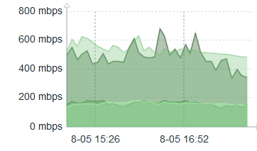
This is the view of multiple vedges which match the selection criteria of high bandwidth usage in region Europe:
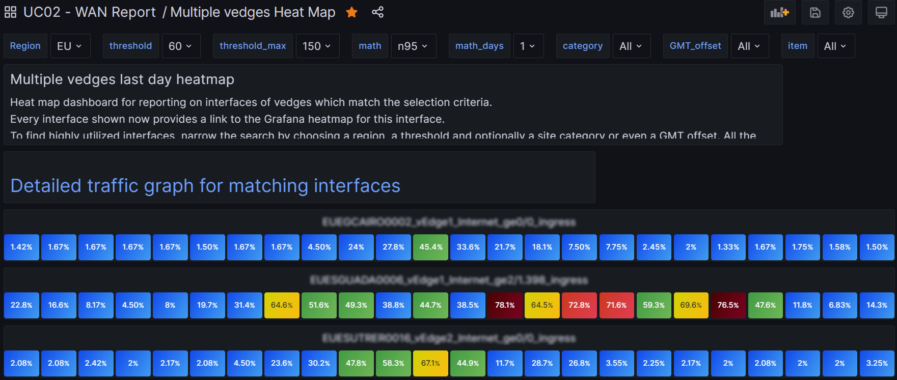
Then I figured out how to provide a link to a detailed traffic graph for this selection criteria. Obviously, that mostly involved switching the visualization to Time Series. But I wanted as well to provide the interface bandwidth on the same graph. That was tricky and involved creating a transform that is a config query which takes speed from the table and turns it into Threshold1, which I draw as a red dashed line. It’s sort of too much detail to go into it further in this article. I wanted to make a second config query but it turns out this is not supported – still.
As for the link, I have a text panel where I use raw html. My HTML, which creates the active link you see displayed is:
<br>
<H2>
<a target="details-multiple-ifaces" href=
"/d/8aXikCa4k/multiple-vedges-graph?orgId=1&${Region:queryparam}&${threshold:queryparam}&${math:queryparam}&${math_days:queryparam}">
Detailed traffic graph for matching interfaces</a>
</H2>
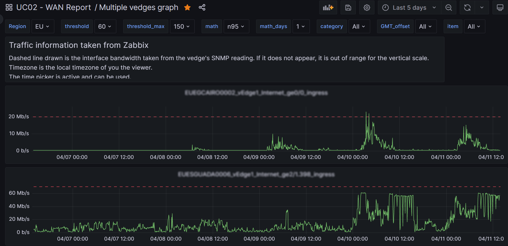
So here is what the detailed traffic graph looks like:
I almost forgot to mention it, there is a second query, B, which I use as a basis for the dynamic threshold to pick up the “speed” of the interface. Here it is:
data = from(bucket: "UC02")
  |> range(start: -1d, stop: now())
  |> filter(fn: (r) =>
    r._measurement == "vedge_stat" and
    r._field == "speed" and r.item == "${item}"
  )
  |> drop(columns: ["item","category","region","GMT_offset"])
data
Back to single vedge
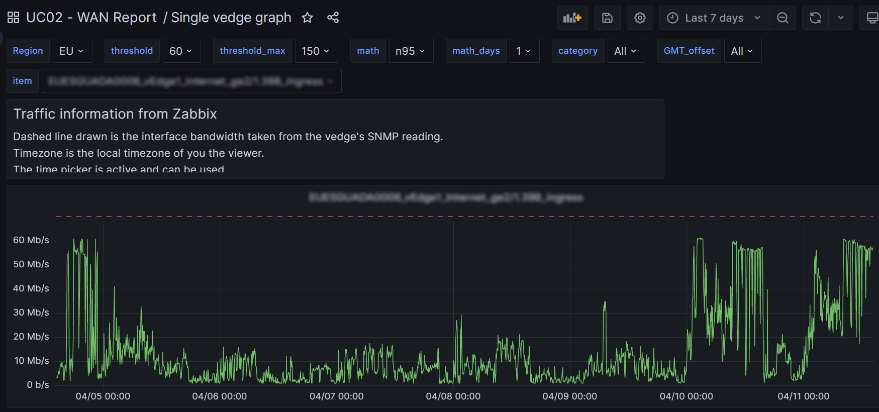
At the top of this post I showed the heat map for a single vedge. It includes an active link which leads to a detailed traffic graph. That link in turn is in a Text Panel with HTML text. This is the HTML.
<br>
<H2>
<a target="details-single-iface" href=
"/d/ozKDXiB4k/single-vedge-graph?orgId=1&${Region:queryparam}&${threshold:queryparam}&${math:queryparam}&${math_days:queryparam}&${item:queryparam}">
Detailed traffic graph for ${item}</a>
</H2>
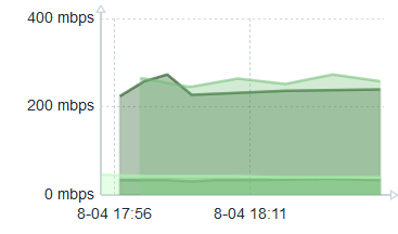
The single vedge detailed graph is a little different from the multiple vedge detailed graph – but not by much. I am getting long-winded so I will omit all the details. Mainly I’ve just blown up the vertical scale and omit panel iteration. So here is what you get:
In full disclosure
In all honesty I added another field called speed to the vedge_stats InfluxDB measurement. It’s kind of redundant, but it made things a lot simpler for me. It is that field I use in the config query to set the threshold which I draw with a red dashed line.
Not sure I mentioned it, but at some piont I re-interpreted the meaning of UTChour to be local time zone hour! This also was a convenience for me since there was a desire to display the heat maps in the local timezone. Instead of messing around with shifting hours in flux query language – which would have taken me days or weeks to figure out, I just did it in my python code I (think) I shared above. So much easier…
Now for the harder stuff, v2.1
Loop over a date range
I really, really wanted my panels to repeat, one panel per day, based on a template variable which represented the days between the two points on the time picker. I.e., i now want my dashboards to incorporate the time picker. Grafana, even v 10, makes this extremely difficult to do. But I did succeed in the end. Painfully. So how did I do it?
I defined a hidden variable I call days3. days1 and 2 were failed attempts! Here is days3, which is a query variable type:
import "regexp"
import "date"
//item = "NAUSDRJOHN0329_vEdge1_MPLS_ge0/1.40_egress" // for testing
startTrunc = date.truncate(t: v.timeRangeStart, unit: 1d)
stopTruncTmp = date.truncate(t: v.timeRangeStop, unit: 1d)
stopTrunc = date.add(d: 1d, to: stopTruncTmp)
from(bucket: "DrJ02")
|> range (start: startTrunc, stop:stopTrunc)
|> filter(fn:(r) => r._measurement == "vedge_stat" and r.item == "${item}")
|> keep(columns:["_time","_value"])
|> aggregateWindow(every: 1d, timeSrc: "_start", fn: last)
|> map(fn: (r) => ({r with timeString: string(v: r._time)}))
|> keep(columns:["timeString"])
|> map(fn: (r) => ({r with timeString: regexp.replaceAllString(r: /T00.*/, v: r.timeString, t:"")}))
I guess it’d take forever to explain. It shows why I call it v 2.1: I learned more stuff since I started out. This produces days3 as a string. Its values are 2013-06-20 2013-06-19, etc. I found I had to choose multi-value and permit All values for it to work with my panel. Not sure why… Then my panel iterates against this variable. Actually not one but two side-by-side panels! The left side produces the day and date, and each of its rows sits alongside the right panel which contains the data for that day. Here is the left hand stat visualization Flux query:
import "array"
import "date"
import "dict"
days3Time = time(v: "${days3}")
month = string(v: date.month(t: days3Time))
day = string(v: date.monthDay(t: days3Time))
dayWint = date.weekDay(t: days3Time)
weekdayOnlyDict = [0:"   ", 1:"Mon", 2:"Tue", 3:"Wed", 4:"Thu", 5:"Fri", 6:"   "]
DAY = dict.get(dict:weekdayOnlyDict, key:dayWint, default:"")
niceDate = DAY + " " + day + "." + month
arr = [{valueString: niceDate}]
array.from(rows: arr)
I don’t use comments because it’s a tiny window you enter code into. So I had to convert days, which was a string, into a time with the time() function. array.from is your friend and can turn a simple array with one element into a table which will be accepted by stat.
Why stat and why not a Text panel?
The fonts deployed in stat are much better than what you can probably whip up yourself in a Text panel. So no sense wasting time figuring out CSS and all. Just give in a use Stat.
So that left hand side produces a row with Tue 20.6 for today. It has a vyer narrow width and it repeats vertically.
Query for template vs query for the panel
They’re kind of sort of both using Flux. But probably the panel needs to incorporate more logic.
Invalid character ‘\x1f’ looking for beginning of value
You know that days3 variable I mentioned above? I swear this is true. I referred to it in my first panel query using naked reference ${days3} and all was good as bonus it was even interpreted as a time variable. Then for my second panel I literally copied the query from the first one, and yet I got this error: Invalid character ‘\x1f’ looking for beginning of value. As all my eperiments cost me precious time, I don’t have the exact reason for this error. It can be one of these things:
- reference to variable where All and multi-value was selected
- naked reference to template varibale: ${template_variable} instead of “${template_variable}”
Most likely it’s related to the second bullet item. So in my second panel I had to introduce the double-quotes, which had the side-effect of I guess forcing its interpretation as a string, not a time, which required me to convert it. And then – I swear this is the case – after fixing my second panel up, my first panel – which mind you had been fine all this time – began to complain as well! So then I had to go into my previously working first panel query and put double-quotes around its reference to days3 and convert it to a time. I became scared about variable scope and assigned days3 to a different variable to be safe. Again, no time for proper experimentation.
That’s either a bug or a screwy fact about variable scope.
compilation failed. error Unexpected token for property key DOT (.)
This error usually occurs when you reference a non-existent column name in a map function, perhaps due to a typo in the column name.
Template Variable reference (interpolation)
Sometimes a naked reference to a template variable such as ${template_variable} suffices, and sometimes you gotta have double-quotes around that reference. And you may even need the double quotes in a chained variable whereas your panel query expression is fine without them. I have to read up more on what’s going on there to come up with a consistent recommendation. For now it’s trial and error.
The easiest way to use stat visualization for a text header
import "array"
arr = [{valueString: "SSID vedge ltype iface direction"}]
array.from(rows: arr)
Yup. That works. And you get a very nice stat box. Just choose showing Fields: valueString, Text mode: value, Text size (value): 14, Color mode: background solid, and maybe a nice base color like kind of dark blue. This is good for a header column which is a panel which is one unit high.
array.from is your friend
And it magically makes tables out of any kind of junk as in the example directly above, by junk I mean when you don’t care about the time.
Tip: Grafana’s error recognition is good
It tries to tell you exactly which column within which line of your query it doesn’t like.
But, also, frequently switch between the stat view and Table to really see what’s going on. Because you only get a small wnidow real estate, use your mouse scroll button after appropriately positioning your mouse to view all values.
Tip: frequently shift between regular view and stat view
You are dead without that table view option as you develop your queries. And use a large monitor! And learn to minimize the Stat options by hitting the rightward point arrow. You will make lots of mistakes and the Table view is the only way to see what’s going on.
Avoid Row of panels
I was initially using row of panels. It wastes lots of precious screen real estate. A minimum of 3 vertical units are required, I believe. And it was slow. Instead, I found I can use side-by-side vertically repeating panels each one unit high.
Panel geometry
I keep referring to units. It’s a term I made up. But panels seem to observe snap geometry and can only come in certain units of sizes. The smallest unit is reasonable, I suppose. Working with small panels can be a bear however – tring to find where to position the mouse to get to the Edit menu can be challenging.
WAN Report example, July 2023
Meanwhile I’ve learned some more tricks and I will share everything… Some thing are obvious, some not so much. The end result is 60 awesome lines of Flux language coding!
Setting the scene
I produce a WAN report for the network group to peruse. Each row is an interesting interface on a vedge, either the Inernet or MPLS interface. The combo site ID_vedgeNumber_iface-type_iface-name_direction is the left column. On the right are columns which provide the average, n95 and max values of that interface for, by default, the last 24 hours, but only during business hours.
It looks like this:
The template variables at the top are:
- Region
- threshold
- math
- math_days
- GMT_offset
- country
- SSID
- item
A word about the panel layout
I realized you don’t need and should not use repeating rows of panels. Just iterate over something. I iterate over item which I think of as a dependent variable. Everything before item is a filter criteria which determines the included items. Then I simply size a panel on the left to be one unit high and just long enogh to accommodate my longest item name. To the right of that is a second panel sized also to be one unit high and several units long. Both are set up with the stat visualization and repeat for template variable item. I don’t know why I didn’t think of this approach earlier!
Start simple: the left column containing the item names
Easy peasey:
import "array"
arr = [{valueString: "${item}"}]
array.from(rows: arr)
Note I am using the array.from trick to create a table. I use the stat visualization even though Text is the more obvious choice because stat has excellent fonts!
In stat I repeat by variable item as already mentioned. The field valueString as the one to be included in the panel. Color mode is background solid, Text mode is Value. I have a Data link to my single vedge heatmap. This link is: /d/fdasd-1a18-f9037d3/single-vedge-heat-map-v2-1?orgId=1&&var-days3=All&${Region:queryparam}&${threshold:queryparam}&${math:queryparam}&${math_days:queryparam}&${item:queryparam}
Panel with avg/n95/max
By contrast, this panel forced me to learn new techniques and is somewhat complex.
import "math" // v 2.13 -DrJ 2023.07.05
import "array"
import "regexp"
import "strings"
import "date"
import "dict"
import "join"
CC = strings.substring(v: "${item}", start:2, end:4) // returns, e.g., US
regionOffsetDict = ["AP":8h,"NA":-4h,"EU":0h,"SA":-3h]
offset_dur = dict.get(dict:regionOffsetDict, key:"${Region}", default:0h)
startRegion = date.add(d: offset_dur, to: v.timeRangeStart)
startTrunc = date.truncate(t: startRegion, unit: 1d)
stopRegion = date.add(d: offset_dur, to: v.timeRangeStop)
stopTrunc = date.truncate(t: stopRegion, unit: 1d)
startDayInt = date.yearDay(t: startTrunc)
stopDayInt = date.yearDay(t: stopTrunc)
timePickerDays = stopDayInt - startDayInt
data = from(bucket: "${bucket}")
  |> range(start:startTrunc, stop: stopTrunc)
  |> filter(fn: (r) =>
    r._measurement == "vedge" and
    r._field == "percent" and r.hostname =~ /^${Region}/ and r.item == "${item}" and
    (r.UTChour == "08" or r.UTChour == "09" or r.UTChour == "10" or r.UTChour == "11"
    or r.UTChour == "12" or r.UTChour == "13" or r.UTChour == "14" or r.UTChour == "15"
    or r.UTChour == "16" or r.UTChour == "17" or r.UTChour == "18")
  )
  |> map(fn: (r) => ({r with dayNumber: date.weekDay(t: r._time) })) // get day of week
  |> map(fn: (r) => ({r with day: date.yearDay(t: r._time) })) // get day of year
  |> map(fn: (r) => ({r with day: string(v: r.day)})) // convert day to string cf. day tag in  holidays measurement
  |> map(fn: (r) => ({r with workDay: if r.dayNumber == 0 then false else if r.dayNumber == 6 then false else true  }))
  |> filter(fn: (r) => r.workDay == true or timePickerDays == 1) // just consider work days, i.e., Mon - Fri unless today is Monday
 // |> map(fn: (r) => ({r with day: "185"})) //JH TEMP for debugging the join
  |> keep(columns:["day","_value"])
holidays = from(bucket: "${bucket}") // extract all the holidays for this country
  |> range(start:-58d)
  |> filter(fn: (r) =>
    r._measurement == "holidays" and r.CC == CC
    )
  |> last() // to only spit out the most recent run
  |> group(columns:["year","CC"])
  |> keep(columns:["day","_value"])
myjoin = join.left(   // join iface data with holiday data
    left: data,
    right: holidays,
    on: (l, r) => l.day == r.day,
    as: (l, r) => ({_value: l._value, holiday_flag:r._value})
  )
dataNoHolidays = myjoin // only take data where there was no holiday OR time period == 1 day
 |> filter(fn: (r) => not exists r.holiday_flag or timePickerDays == 1)
 |> keep(columns:["_value"])
meanTbl = dataNoHolidays |> mean()
maxTbl = dataNoHolidays
  |> max()
  |> toFloat()
n95Tbl = dataNoHolidays |> quantile(q: 0.95)
3values = union(tables: [meanTbl,n95Tbl,maxTbl])
 |> map(fn: (r) => ({r with _value: math.trunc(x: r._value)}))
 |> map(fn: (r) => ({r with valueString: string(v: r._value)+"%"}))
 |> keep(columns:["_value","valueString"])
3values
There is a lot going on here but when you break it down it’s not so bad. Let me highlight the last peice I struggled with last week.
To begin with I wanted to know if we could exclude weekends in the calculation. That is possible. The idea is that we create a columns dayNumber and workDay in that order. dayNumber is the day of the week and workDay is a boolean – either true or false. I found you could do this in incremental steps.
map(fn: (r) => ({r with dayNumber: date.weekDay(t: r._time) })) // get day of week
sets up the dayNumber column and then
map(fn: (r) => ({r with workDay: if r.dayNumber == 0 then false else if r.dayNumber == 6 then false else true }))
creates the boolean workDay. Then you run the filter:
filter(fn: (r) => r.workDay == true or timePickerDays == 1) // just consider work days, i.e., Mon - Fri unless today is Monday
So now you have tossed out weekend days. Cool.
Extend this to exclude national holidays
Extending this to also exclude national holidays is much harder however. At least I did not find a nice way to do it, so I did it the hard way. Of course first I had to etermine the national holidays. I didn’t want to use an api because I feel that would slow things down and speed is of essence.
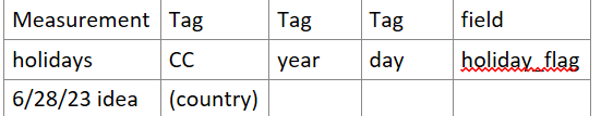
The main idea is to use the python holidays package. I suppose I could have created a CSV file with the results but I didn’t. I stuffed the results into another measurement which I define as:
The main python code which fills this measurement is:
from datetime import date
from datetime import datetime
import holidays
from modules import aux_modules, influx_modules

year = datetime.now().year

# CCs was scraped from the country variable in Grafana from WAN Report
file = 'CCs'
with open(file) as f:
    CCs = f.read().splitlines()
print('CCs',CCs)

my_dict = {}

for CC in CCs:
    print(CC)
    CC_missing = False
    try:
        CC_holidays = holidays.country_holidays(CC,years=[year])
    except:
        CC_missing = True

    for mydate,name in sorted(CC_holidays.items()):
        day_of_year = mydate.timetuple().tm_yday
        print(CC,mydate,day_of_year)
        if not CC in my_dict: my_dict[CC] = []
        my_dict[CC].append(day_of_year)
# prepare our Pts data structure
Pts = aux_modules.holidays_to_pts(year,my_dict)
for Pt in Pts:
    print('Pt',Pt,flush=True)
influx_modules.data_entry_stats(Pts)
print('All done!')
The file CCs just has countries of interest, one per line:
US
CA
MX
ES
etc
That holidays_to_pts function is very basic:
def holidays_to_pts(year,my_dict):
# turn dict into a list of points which can be fed into influxdb
# {'US':[1,67,357]}

    Pts = []
    time = int(tm.time()) # kind of a fake time. I don't think it matters
    for CC,holiday_list in my_dict.items():
        for day in holiday_list:
            tags = {'CC':CC,'year':year,'day':day}
            fields = {'holiday_flag':True}
            Pt = {'measurement':'holidays','tags':tags,'fields':fields,'time':time}
            Pts.append(Pt)
    return Pts
So we’ve got our holidays measurement. I suppose it could have been written to CSV file but I got used to working with time series so I stuffed the holiday information into InfluxDB as though it were another time series.
I do not see an easy way to refer to a different measurement without introducing a new expression and then joining the data all together with a left outer join. Ideally I would have stuffed the holiday information into a dictionary and then just done a lookup against the dictionary. And I eventually thought of a way to fill a dictionary: use out-of-band code generation! But that would be ugly so i veto that idea. Back to the left outer join approach: I eventually got this to work after much trial and error.
Thus I build up the data table with all my filters and such and reduce it at the end to the bare necessities for the join: keep only the columns day and _value. And I create a holidays table which at the end also contins only those two columns. So now I have a common group key and can do the join based on the identical day values. As my holidays is compact and only contains entries for the actual holiday days, the join produces a null value for a day in which there is no match. So the left outer join produces a table, myjoin, with the columns from the data table, plus a column holiday_flag from holidays with the value either true or null.
Left outer join
To get it right definitely required working up from simpler examples using Explorer.
import "array"
import "join"

left =
    array.from(
        rows: [
            {_time: 2022-01-01T00:00:00Z, _value: 1, day: 1, label: "a", percent: 1},
            {_time: 2022-01-01T00:00:00Z, _value: 2, day: 1, label: "b", percent: 2},
            {_time: 2022-02-01T00:00:00Z, _value: 22, day: 1, label: "b", percent: 3},
            {_time: 2022-01-01T00:00:00Z, _value: 3, day: 1, label: "d", percent: 4},
            {_time: 2023-01-01T00:00:00Z, _value: 4, day: 1, label: "a", percent: 5},
			{_time: 2023-01-01T00:00:00Z, _value: 4, day: 11, label: "a", percent: 11},
        ],
    )
right =
    array.from(
        rows: [
            {_time: 2022-01-01T00:00:00Z, _value: true, day: 11, label: "a"},
            {_time: 2022-01-01T00:00:01Z, _value: true, day: 11, label: "a"},
            {_time: 2022-01-01T00:00:00Z, _value: false, day: 11, label: "b"},
            {_time: 2022-01-01T00:00:00Z, _value: true, day: 11, label: "d"},
        ],
    )
join.tables(
    method: "left",
    left: left,
    right: right,
    on: (l, r) => l.label == r.label and l.day == r.day,
    as: (l, r) => ({_time: l._time, label: l.label, v_left: l._value, v_right: r._value, percent: l.percent}),
)
So this helps to get practice: getting the group key to be identical in the two tables, seeing what happens when the left table has entries unmatched in the right table, the right table has duplicated keys, etc.
If I ever figure out a way to avoid the left outer join – and I suspect there is a way – I will use it and update my code. part of my problem is that Flux sucks as far as iterations go. The time windowa may span more than one day. Ideally I would loop over days (then holidays could be stuffed into a dictionary I suppose), but bear in mind I’m already repeating by item. Loop programming is not supported in Flux, which sucks.
So, anyway, myjoin can now be filtered to only accept non-holiday days:
filter(fn: (r) => not exists r.holiday_flag or timePickerDays == 1)
That produces the dataNoHolidays table which is then used for aggregate functions such as mean() , max() and quantile(). The mean, n95 and max are tables because basically everything is tables and you can’t avoid it. So then a relatively simple union of tables is used to join these three tables to get our three numbers output.
Monday effect
I also wanted to make the time picker active since that is the “native” way to select time periods. I made the default time from now – 24 hours to now. But I then truncate on day boundaries to keep results as naively expected. But how to avoid the Monday effect? You’ve exlcuded weekends so now you have no data if it is a Monday!
Hence I also calculate the number of days in the time picker range (timePickerDays). If it’s only one day (the default), then do include weekends and holidays. If it’s longer than one day then someone has interacted with the time picker and has intention to get something of meaning back out such as the n95 value when considering just workdays (no weekends or holidays) from, say, the past week.
Text panel
There is a text panel which explains things. I may as well include all that verbatim.
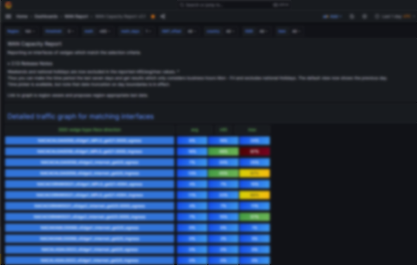
#### WAN Capacity Report
Reporting on interfaces of vedges which match the selection criteria.
##### v 2.13 Release Notes
Weekends and national holidays are now excluded in the reported n95/avg/max values. *
Thus you can make the time period the last seven days and get results
which only considers business hours Mon - Fri and excludes national Holidays.
The default view now shows the previous day.
Time picker is available, but note that date truncation on day boundaries is in effect.

Link to graph is region-aware and proposes region-appropriate last data.
The link to the single vedge heatmap is back!
Click on the name of the vedge to get the historical heatmap for this interface.
Improved formatting.

*) This behavior is overwritten when the default time picker of last 24 hours is in effect
to avoid the situation where no
data will be shown such as on a Monday or the day after a holiday. But if you choose a custom timespan longer than one day,
weekends and national holidays specific to the country of that SSID
will be excluded from the mean/n95/max calculations.

To find highly utilized interfaces, narrow the search by choosing a region, a threshold and optionally a site category or even a GMT offset. All the vedge interfaces which match the criteria will be displayed in the drop down list.
The statistics are gathered from the previous day (if math_days is set to 1). Three different algorithms are calculated.
n95 is the 95% percentile usage point (over business hours), avg is the average (over business hours) and max is the peak usage point.
The GMT_offset is a semi-dependent variable: its range of values is restricted by the region chosen.
It is possible to produce 0 matching results by over constraint.
To test matching on the other variables, lower the threshold to 0.
All number all percentages.
The average (avg), maximum (max) and 95% are calculated for just the business hours of that interface, i.e., from 8 AM to 6 PM.
Click on a displayed item to bring up the historic heat map data from the last few days for it.
Dark red - 75% and higher
Light red - 70 - 74 %
Orange - 60 - 69 %
Green - 40 - 59 %
Blue - 0 - 39 %
Template variables
There is a hidden variable called bucket so I can easily move between DEV and PROD environments. item is the most dependent variable. Here it is:
from(bucket: "poc_bucket2")
|> range (start: -${math_days}d)
|> filter(fn:(r) => r._measurement == "vedge_stat")
|> filter(fn:(r) => r.region == "${Region}")
|> filter(fn:(r) => contains(value: r.country, set: ${country:json}))
|> filter(fn:(r) => contains(value: r.SSID, set: ${SSID:json}))
|> filter(fn:(r) => contains(value: r.GMT_offset, set: ${GMT_offset:json}))
|> filter(fn:(r) => r._field == "${math}" and r._value >= ${threshold})
|> group()
|> distinct(column: "item")
The stat panel
The stat panel for the three values shows All Values, has a maximum number of rows to display of 3, repeat direction is Vertical, shows the field _value, has layout orientation Vertical, Text mode Name, Color mode background gradient and Text Size 14. Color scheme is from Thresholds by value.
What’s going on with the times?
Just to mention it, the interfaces all have their data recorded in their local time! In fact we pretned to InfluxDB that that time is UTC time, though it isn’t. This permitted us to do many cool things, not so much for this WAN report as for the multi vedge heatmap dashboard. We always display the heatmap in the local time of the vedge. But then some accomodation was needed to handle when you’re looknig at Asia and sitting in North America – they could even be onto the next day! Whatever day it is, they are way ahead of you in time, so you have to exceed now() to show their latest data – that sort of thing. But the accommodations were worth it. We just ask that users of the dashboards also set their time to UTC or else nothing makes sense.
WAN Report v 2.15, July 2023
I received suggestions on improving the WAN report. After those refinements it looks like this:
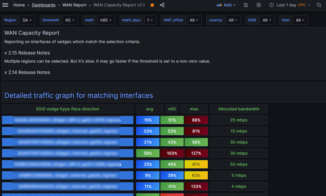
So the additional column Allocated bandwidth was requested. That was pretty straightforward. In the detailed graph there was the request to combine ingress and egress interfaces. And always show the allocated bandwidth (it was only occasionally showing). Another request was to permit more than one Region to be selected. This sounds kind of easy, but it required some pretty significant re-work. Fortunately I have enough experience now that it was just adding on a good existing foundation.
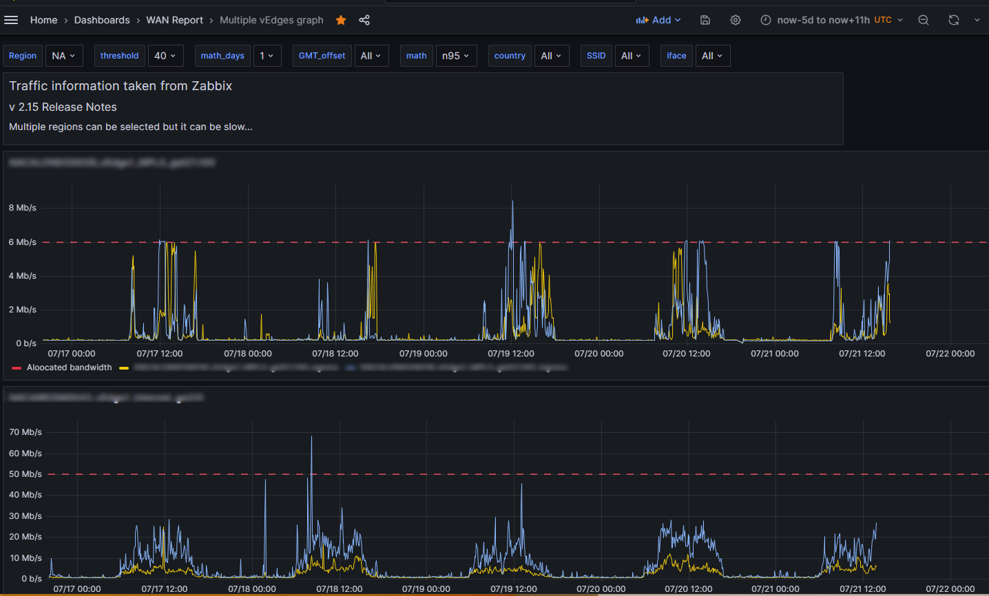
And the result is just very visually appealing, I must say! Here is the graph, suitably blured:
Awesome, right!? Now how did I work the magic? Buckle your seats, it’s going to get bumpy…
Variables
Here are all my variables for the WAN Report, bunched together for compactness. Comment lines at the beginning provide variable name and a hint about the type.
# Region
# type Custom, multi-value
AP,EU,NA,SA

# RegionalNowOffset
# type: hidden
import "array"
import "dict"
regionOffsetDict = ["AP":11,"NA":-4,"EU":2,"SA":-3]
offset_dur = dict.get(dict:regionOffsetDict, key:"${Region}", default:11) // if multi-value, assume worst case
prefix = if offset_dur > 0 then "%2B" else ""
offsetString = prefix + string(v: offset_dur) + "h"
arr = [{valueString: offsetString}]
array.from(rows: arr)

# bucket
# type: custom, hidden

# threshold
# type: custom
0,20,40,60,80,90,95

# math
# type: custom
n95,avg,max

# math_days
# type: custom
1,2,7

# GMT_offset
# type: query, multi-value
from(bucket: "${bucket}")
|> range (start: -1d)
|> filter(fn:(r) => r._measurement == "vedge_stat")
//|> filter(fn:(r) => r.region == "${Region}")
|> filter(fn:(r) => contains(value: r.region, set: ${Region:json}))
|> group()
|> distinct(column: "GMT_offset")

# country
# type: query, multi-value
from(bucket: "${bucket}")
|> range (start: -1d)
|> filter(fn:(r) => r._measurement == "vedge_stat")
//|> filter(fn:(r) => r.region == "${Region}")
|> filter(fn:(r) => contains(value: r.region, set: ${Region:json}))
|> group()
|> distinct(column: "country")

# SSID
# type: query, multi-value
from(bucket: "${bucket}")
|> range (start: -1d)
|> filter(fn:(r) => r._measurement == "vedge_stat")
//|> filter(fn:(r) => r.region == "${Region}")
|> filter(fn:(r) => contains(value: r.region, set: ${Region:json}))
|> filter(fn:(r) => contains(value: r.country, set: ${country:json}))
|> group()
|> distinct(column: "SSID")

# item
# type: custom, multi-value
from(bucket: "${bucket}")
|> range (start: -${math_days}d)
|> filter(fn:(r) => r._measurement == "vedge_stat")
//|> filter(fn:(r) => r.region == "${Region}")
|> filter(fn:(r) => contains(value: r.region, set: ${Region:json}))
|> filter(fn:(r) => contains(value: r.country, set: ${country:json}))
|> filter(fn:(r) => contains(value: r.SSID, set: ${SSID:json}))
|> filter(fn:(r) => contains(value: r.GMT_offset, set: ${GMT_offset:json}))
|> filter(fn:(r) => r._field == "${math}" and r._value >= ${threshold})
|> group()
|> distinct(column: "item")
And that’s the easy part!
Link to detailed traffic graph
This is a text panel, actually. Here’s the text:
<br>
<h2>
<a target="details-multiple-ifaces" href="/d/8V9ka4k/multiple-vedges-graph?orgId=1&${Region:queryparam}&${threshold:queryparam}&${math:queryparam}&${math_days:queryparam}&${country:queryparam}&${SSID:queryparam}&from=-5d&to=now${RegionalNowOffset}">
Detailed traffic graph for matching interfaces>/a>
</h2>
The vedge_…iface_direction column query
I’ve previously discussed how I did the headers, so let’s talk about the queries which make up the columns. The leftmost column names the interface + direction. It uses a stat panel – remember I like the text output of stat!
import "array" //we rely on the template variable item to populate our string
import "strings"
region = strings.substring(v: "${item}", start:0, end:2) // returns, e.g., NA
arr = [{valueString: "${item}", region:region}]
array.from(rows: arr)
No big deal, right? Maybe the hardest thing was getting the link to work. The link takes you to the heatmap dashboard for that specific interface.
But just to mention it, the stat features: repeat by the variable item, repeat direction vertical, max no. of rows to display is 1, All Values, Fields valueString, Text mode Value, color mode Background solid, text size 14.
And here is the data link, suitably obfuscated:
/d/fads-f2c-418203d3/single-vedge-heat-map-v2-1?orgId=1&&var-days3=All&var-Region=${__data.fields.region}&${threshold:queryparam}&${math:queryparam}&${math_days:queryparam}&${item:queryparam}
So see what I did there? Compared to the earlier version I added the region to the time series so that as a variable it would be available to me to refer to in the data link. That was the only way I saw to do that.
Finding possible variables
I’ve mentioned this elsewhere, but to repeat since it’s a very helpful tip, just type $ and usually it will show you all the possible variable completions. Pick the one you want.
The mean, n95, max column
This is also a one unit height stat, of course, taking three values.
import "math" // v 2.15 -DrJ 2023.07.21
import "array"
import "regexp"
import "strings"
import "date"
import "dict"
import "join"
CC = strings.substring(v: "${item}", start:2, end:4) // returns, e.g., US
region = strings.substring(v: "${item}", start:0, end:2) // returns, e.g., NA
regionOffsetDict = ["AP":8h,"NA":-4h,"EU":0h,"SA":-3h]
offset_dur = dict.get(dict:regionOffsetDict, key:region, default:0h)
startRegion = date.add(d: offset_dur, to: v.timeRangeStart)
startTrunc = date.truncate(t: startRegion, unit: 1d)
stopRegion = date.add(d: offset_dur, to: v.timeRangeStop)
stopTrunc = date.truncate(t: stopRegion, unit: 1d)
startDayInt = date.yearDay(t: startTrunc)
stopDayInt = date.yearDay(t: stopTrunc)
timePickerDays = stopDayInt - startDayInt
data = from(bucket: "${bucket}")
  |> range(start:startTrunc, stop: stopTrunc)
  |> filter(fn: (r) => r._measurement == "vedge")
  |> filter(fn: (r) => r.item == "${item}") // this automatically takes care of the region match
  |> filter(fn: (r) =>  r._field == "percent" and
    (r.UTChour == "08" or r.UTChour == "09" or r.UTChour == "10" or r.UTChour == "11"
    or r.UTChour == "12" or r.UTChour == "13" or r.UTChour == "14" or r.UTChour == "15"
    or r.UTChour == "16" or r.UTChour == "17" or r.UTChour == "18")
  )
  |> map(fn: (r) => ({r with dayNumber: date.weekDay(t: r._time) })) // get day of week
  |> map(fn: (r) => ({r with day: date.yearDay(t: r._time) })) // get day of year
  |> map(fn: (r) => ({r with day: string(v: r.day)})) // convert day to string cf. day tag in  holidays measurement
  |> map(fn: (r) => ({r with workDay: if r.dayNumber == 0 then false else if r.dayNumber == 6 then false else true  }))
  |> filter(fn: (r) => r.workDay == true or timePickerDays == 1) // just consider work days, i.e., Mon - Fri unless today is Monday
  |> keep(columns:["day","_value"])
holidays = from(bucket: "${bucket}") // extract all the holidays for this country
  |> range(start:-58d)
  |> filter(fn: (r) =>
    r._measurement == "holidays" and r.CC == CC
    )
  |> last() // to only spit out the most recent run
  |> group(columns:["year","CC"])
  |> keep(columns:["day","_value"])
myjoin = join.left(   // join iface data with holiday data
    left: data,
    right: holidays,
    on: (l, r) => l.day == r.day,
    as: (l, r) => ({_value: l._value, holiday_flag:r._value})
  )
dataNoHolidays = myjoin // only take data where there was no holiday OR time period == 1 day
 |> filter(fn: (r) => not exists r.holiday_flag or timePickerDays == 1)
 |> keep(columns:["_value"])
meanTbl = dataNoHolidays |> mean()
maxTbl = dataNoHolidays
  |> max()
  |> toFloat()
n95Tbl = dataNoHolidays |> quantile(q: 0.95)
3values = union(tables: [meanTbl,n95Tbl,maxTbl])
 |> map(fn: (r) => ({r with _value: math.trunc(x: r._value)}))
 |> map(fn: (r) => ({r with valueString: string(v: r._value)+"%"}))
 |> map(fn: (r) => ({r with region: region})) // just needed for the link
3values
So it’s similar to what I had before, but I had to re-work the region matching. But since I repeat by item, I have the luxury to know I am in a specific region for this particular interface and I use that information.
The relatively hard stuff about the left outer join remain the same as explained early July section. I also put the same data link as the left-most column has, just to make things easy for the user.
New column: allocated bandwidth
data = from(bucket: "${bucket}")
  |> range(start: -2d, stop: now()) // take last two days in case one run had an error
  |> filter(fn: (r) =>
    r._measurement == "vedge_stat" and
r._field == "speed" and r.item == "${item}"
  )
  |> last() // but now we just keep the last values
  |> keep(columns: ["_value"])
  |> map(fn: (r) => ({r with _value: r._value * 0.000001})) // bps to mbps, roughly
  |> map(fn: (r) => ({r with valueString: string(v: r._value ) + " mbps"})) // create a string field
  data
Not too difficult once you know the basics, right? It takes advantage of having the speed column in the vedge_stat measurement.
Multi vedge graph based on interfaces, not items
Now where things really get squirrelly is the multi vedge graph dashboard that is linked to the WAN Report dashboard. Whereas the WAN report lists each item separately and thus ingress and egress are shown in their own separate rows for a given interface, I’ve been asked to combine ingress and egress for the graph view. Plus show the allocated bandwidth for good measure! How to do all that??
Well, I found a way.
I created a new template variable iface. The other template variables are pretty much the same. iface is defined as follows.
import "regexp"
from(bucket: "${bucket}")
|> range (start: -${math_days}d)
|> filter(fn:(r) => r._measurement == "vedge_stat")
//|> filter(fn:(r) => r.region == "${Region}")
|> filter(fn:(r) => contains(value: r.region, set: ${Region:json}))
|> filter(fn:(r) => contains(value: r.country, set: ${country:json}))
|> filter(fn:(r) => contains(value: r.SSID, set: ${SSID:json}))
|> filter(fn:(r) => contains(value: r.GMT_offset, set: ${GMT_offset:json}))
|> filter(fn:(r) => r._field == "${math}" and r._value >= ${threshold})
// next line will remove the _ingress or _egress at the end of the item name
|> map(fn: (r) => ({r with iface: regexp.replaceAllString(r: /_[ine]{1,2}gress/, v: r.item, t:"")}))
|> group()
|> distinct(column: "iface") // just show distinct interface names
So I took advantage of the common elements in item that I wanted to group together, namely, everything other than ingress / egress, which appear last in the item name. So they are combined via RegEx manipulations. But that’s not the last of my tricks…
Time Series
So I use the time series display, of course. The main Flux query which does the magic is this one:
import "regexp"
iface2 = regexp.quoteMeta(v: "${iface}") // this escapes our . and / characters
ifaceRegex = regexp.compile(v: iface2) // item will be matched against this iface regex
data = from(bucket: "${bucket}")
  |> range(start: v.timeRangeStart, stop: v.timeRangeStop)
  |> filter(fn: (r) =>
    r._measurement == "vedge" and
    r._field == "value" and r.item =~ ifaceRegex
    )
  |> keep(columns: ["_time","_value","item"])
speeddata = from(bucket: "${bucket}") //get the speed data
  |> range(start: v.timeRangeStart, stop: v.timeRangeStop)
  |> filter(fn: (r) =>
    r._measurement == "vedge_stat" and
    r._field == "speed" and r.item =~ ifaceRegex
  )
  |> map(fn: (r) => ({r with item: string(v: "Allocated bandwidth")}))
  |> keep(columns: ["_time","_value","item"])
  |> last()
3values = union(tables: [data,speeddata])
3values
Two items will RegEx match against one iface and produce two time series, assuming we keep the right columns. The visualization is repeated by variable iface. I treat the speed like a third time series even though it really is a single number. And I arrange for it to have a nice name: Allocated bandwidth.
Why treat allocated bandwidth (speed) as a time series? By doing this I knew it would assure that it always gets drawn in the graph! This solved the problem I had until now wherein the nice red dashed line, which ws the threshold, wasn’t visible on the time series graph if the interface usage data was well below that value, which it often is. Now the red dashed thrshold line is always drawn in every graph.
Well, that’s query A. Then there’s query B:
import "regexp"
iface2 = regexp.quoteMeta(v: "${iface}")
ifaceRegex = regexp.compile(v: iface2) // item will be matched against this iface regex
data = from(bucket: "${bucket}")
  |> range(start: -2d, stop: now())
  |> filter(fn: (r) =>
    r._measurement == "vedge_stat" and
    r._field == "speed" and r.item =~ ifaceRegex
  )
  |> last()
  |> drop(columns: ["item","category","region","GMT_offset","country","SSID"])
data
Query B is to get the speed. Query B is used in a Transform:
So this transform dynamically sets a threshold and we show Thresholds as lines (dashed).
Wait. But there’s more! Remember this speed is also a “series” based on query A. But it’s really a fake series. But I cleverly arranged for this fake series to have the same color as my red dashed line showing the thrshold via an override!
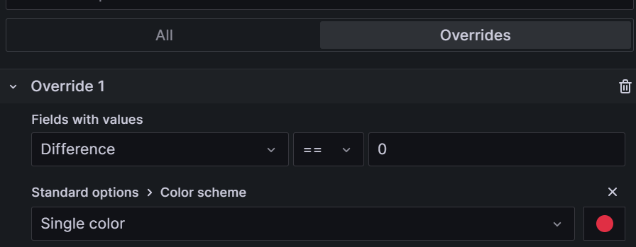
In addition I managed to provide a link to the single item heatmap, which also required yet another trick. That link is:
/d/fdabsfdb-hbs-9jnd-7d3/single-vedge-heat-map-v2-1?orgId=1&${Region:queryparam}&${threshold:queryparam}&${math:queryparam}&${math_days:queryparam}&var-item=${__field.labels.item}
Site Bandwidth, Aug 2023
This is another awesome visualization I developed which rehashes much of what you’ve seen above, but introduces a brand new feature: the ability to display different time series depending on a drop-down list!
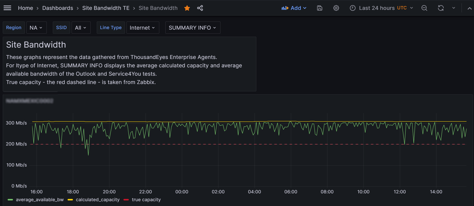
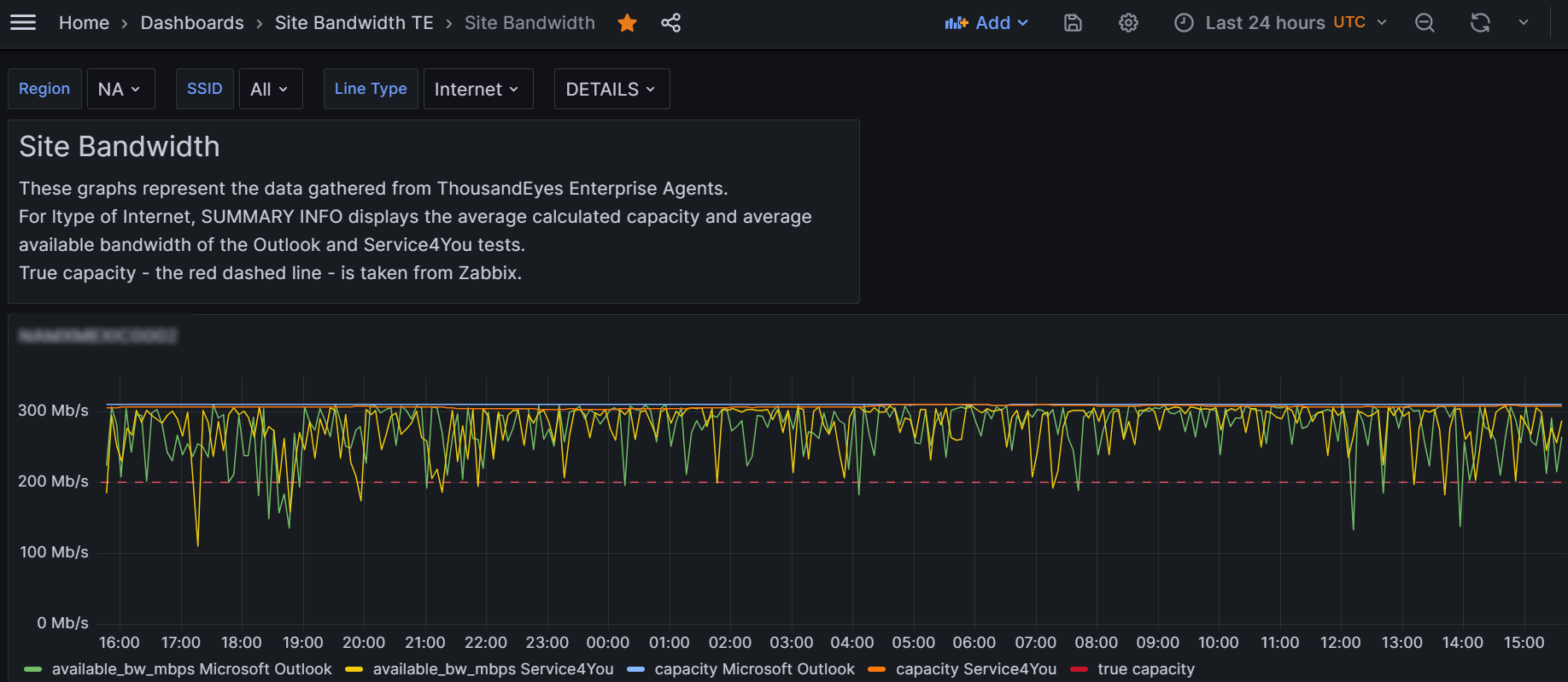
Here are the nitty gritty details.
Here are all the variable definitions, bunched together with a comment telling you the variable name.
// Region - custom, multi-value variable
AP,EU,NA,SA
// bucket - custom, hidden variable
UC03
// SSID - query, multi-value variable
import "strings"
from(bucket: "${bucket}")
|> range (start: -12h)
|> filter(fn:(r) => r._measurement == "SSID_bw")
|> map(fn: (r) => ({r with region: strings.substring(v: r.SSID, start: 0, end: 2)}))
|> filter(fn:(r) => contains(value: r.region, set: ${Region:json}))
|> group()
|> distinct(column: "SSID")
// ltype - query
import "strings"
from(bucket: "${bucket}")
|> range (start: -12h)
|> filter(fn:(r) => r._measurement == "SSID_bw")
|> map(fn: (r) => ({r with region: strings.substring(v: r.SSID, start: 0, end: 2)}))
|> filter(fn:(r) => contains(value: r.region, set: ${Region:json}))
|> group()
|> distinct(column: "SSID")
// bucket_uc02 - custom, hidden
UC02
// summary - custom
SUMMARY INFO,DETAILS
Awesomeness – query A
Most of the awesomeness of this dashboard is in query A:
import "strings"
import "array"
empty = array.from( rows: [{}]) // an empty table which we will use later on
dataDetails = from(bucket: "${bucket}")   // this will show all time series
  |> range(start: v.timeRangeStart, stop: v.timeRangeStop)
  |> filter(fn:(r) => r._measurement == "SSID_bw")
  |> filter(fn:(r) => r.SSID == "${SSID}")
  |> filter(fn:(r) => r.ltype == "${ltype}")
  |> filter(fn:(r) => r._field == "available_bw_mbps" or r._field == "capacity")
  |> drop(columns:["ltype","SSID"])
dataCapacity = from(bucket: "${bucket}") // this averages the capacity time series
  |> range(start: v.timeRangeStart, stop: v.timeRangeStop)
  |> filter(fn:(r) => r._measurement == "SSID_bw")
  |> filter(fn:(r) => r.SSID == "${SSID}")
  |> filter(fn:(r) => r.ltype == "${ltype}")
  |> filter(fn:(r) => r._field == "capacity")
  |> map(fn: (r) => ({r with "calculated_capacity": r._value}))
  |> keep(columns:["calculated_capacity","_time"])
  |> aggregateWindow(column: "calculated_capacity", every: 5m, fn: mean)
  |> keep(columns:["calculated_capacity","_time"])
dataBW = from(bucket: "${bucket}")  // to get the average of the available bw data
  |> range(start: v.timeRangeStart, stop: v.timeRangeStop)
  |> filter(fn:(r) => r._measurement == "SSID_bw")
  |> filter(fn:(r) => r.SSID == "${SSID}")
  |> filter(fn:(r) => r.ltype == "${ltype}")
  |> filter(fn:(r) => r._field == "available_bw_mbps")
  |> map(fn: (r) => ({r with "average_available_bw": r._value}))
  |> keep(columns:["average_available_bw","_time"])
  |> aggregateWindow(column: "average_available_bw", every: 5m, fn: mean)
  |> keep(columns:["average_available_bw","_time"])
speeddata = from(bucket: "${bucket_uc02}") //get the speed data
  |> range(start: -1d, stop: v.timeRangeStop)
  |> filter(fn: (r) => r._measurement == "vedge_stat")
  |> filter(fn: (r) => r._field == "speed"
    and r.SSID == "${SSID}" and strings.containsStr(v: r.item, substr: "${ltype}")
  )
  |> map(fn: (r) => ({r with "true capacity": r._value / 1000000.0})) // convert bps to mbps
  |> map(fn: (r) => ({r with _time: v.timeRangeStop}))
  |> keep(columns: ["true capacity","_time"])
  |> last(column:"true capacity")
if "${summary}" == "SUMMARY INFO" then dataBW else dataDetails
if "${summary}" =="SUMMARY INFO" then dataCapacity |> yield(name: "2") else empty |> yield(name: "empty")
speeddata |> yield(name: "speeddata")
Techniques developed for this dashboard
Time Series displayed depends on drop-down selection
Using conditional logic on the variable summary, we display either summary info, i.e., the average of two series together, or the details, i.e., each available bandwidth and capacity.
Averaging two different time series
I average two time series together for outputting the summary info.
Mulitple time series (tables) shown resulting from semi-complex selection criteria for each
Using the yield function permits me to output a second (or third, fourth, etc) time series after I have outputted the first one.
Conditional logic to determine output of an entire table
As far as I can tell it’s not documented, but it seems to work to use if…then to output a table (as opposed to setting a variables’s value). But as you are required to have a then clause (for some reason), I needed to purposefully create an empty table!
This probably indicates I did things in a less-than-optimally-efficient manner, but oh well. It’s coding that does the job.
How to truncate or alter a template variable
I needed this because one data source referred to the site with the two-letter continent name prepended while another data source omitted those letters, where site is a selected variable. So I created a truncSite template variable as follows.
import "array"
import "regexp"
arr = [{valueString: "${site}"}]
array.from(rows: arr)
|> map(fn: (r) => ({r with siteTrunc: regexp.replaceAllString(r: /^../, v: r.valueString, t:"")}))
|> keep(columns:["siteTrunc"])
Empty table
Using my favorite array.from, I show how to quickly and compactly create an empty table.
Others already described
Query B used to determine the threshold based on interface speed data – that’s already been described in my WAN Report dashboard.
Inefficiency
You may realize I’m calculating time series which may never get displayed, which is true. But it isn’t much data and there isn’t any noticeable penalty so having all my time series at the ready is useful because when a user does change from SUMMARY INFO to DETAILS, the change in the visualization is instant, and hence provides a great user experience.
So, yes, I could have developed two different dashboards, but I like this approach better.
How to use a time series visualization with legend
I’m sure everyone else knows this but until now I never worked with multiple time series, I never displayed a legend, etc, so I didn’t know until I discovered by accident that you click on the series name in the legend and it makes the other series disappear!
And to bring them back hold the CTRL key down before clicking.
To bring up the link is kind of tricky. Your mouse pointer has to be really close to a data point I would say before it works.
Vertical alignment of multiple time series visualizations
This is technically not possible! So you may get kind of close, but not precisely. I was trying to line up things with different units when I noticed they didn’t align! Devices was in one visualization and latency as measured in ms in another. What I did was to add a label to my Devices plot (simply called Devices) to push its start time to the right which made it better aligned (but not perfectly) with the latency visualization above it. Crazy that this feature doesn’t exist. i do this sort of alignment all the time.
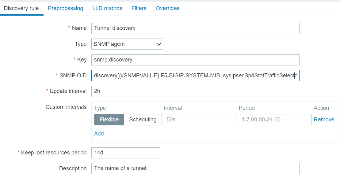
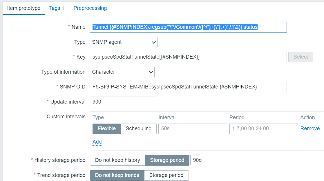
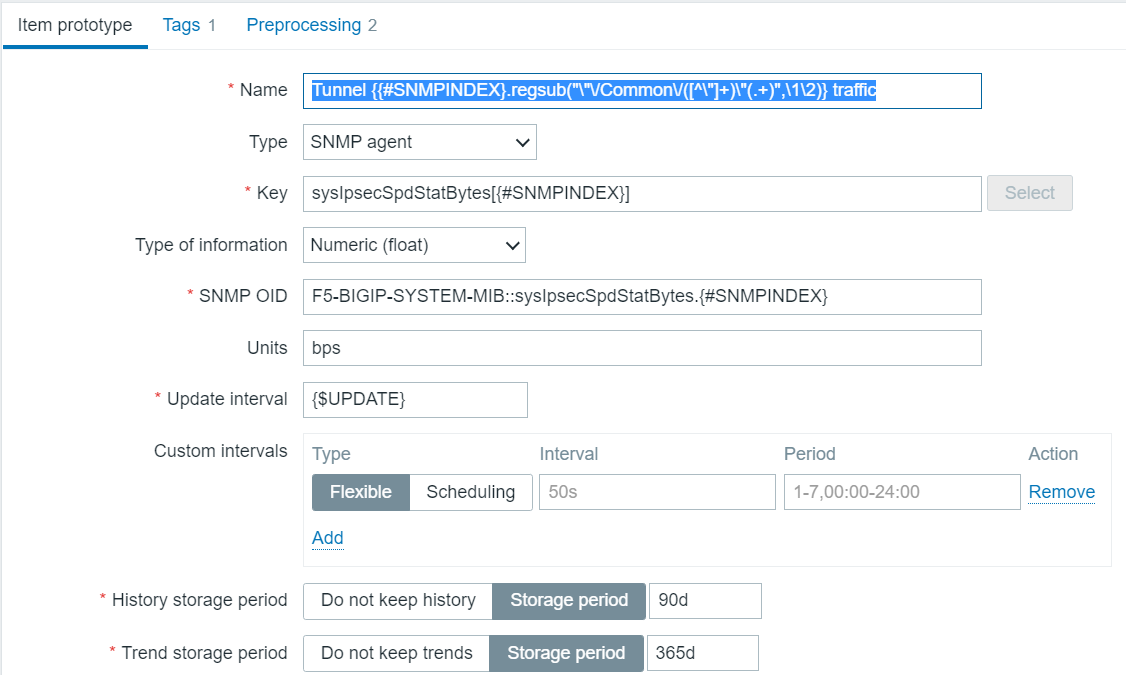
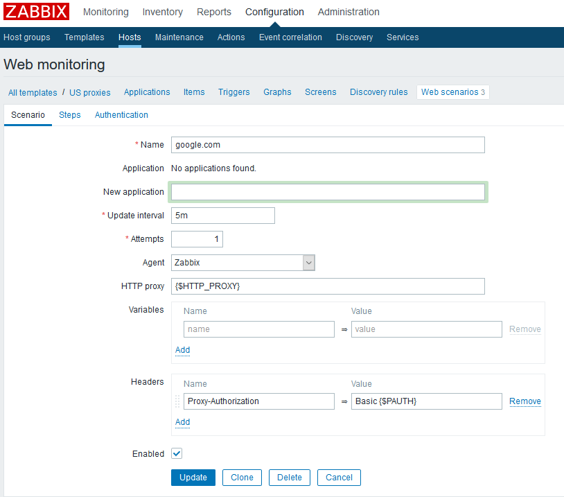
Usage of Zabbix data
There is direct support for the Zabbix api. I use that. But my items from Zabbix provided the bandwidth used by an IPSEC tunnel, but not the percentage used. How to pull the capacity of the Interent circuit from another item and do some simple arithmetic? As with many things in Grafana, this seems to be much more difficult than it should be.
All I could think of is to pull the cpacity from the Zabbix item into a template variable. Then, in yet another template variable, take its reciprocal and multiply by 100! Then finally in the Grafana time series visualization, scale the IPSEC bw used by this reciprocal/percentage variable to come up with the percentage of capacity being used. A bit ugly, but it did work for me. The first variable is speed. The next one I call reciprocalSpeed:
import "array"
speedf = float(v: ${speed})
recip = 100. / speedf // but make it a percentage
arr = [{valueString: recip}]
array.from(rows: arr)
The reason I felt forced to go this route is that once you choose Zabbix as your source, there is very little manipulation you get to do. Scale is one of the few things available to you.
Executive View for China example
I don’t know how much time I have to go into the details. But a very important lesson or two is to be learned by understanding what I did in creating this dashboard.
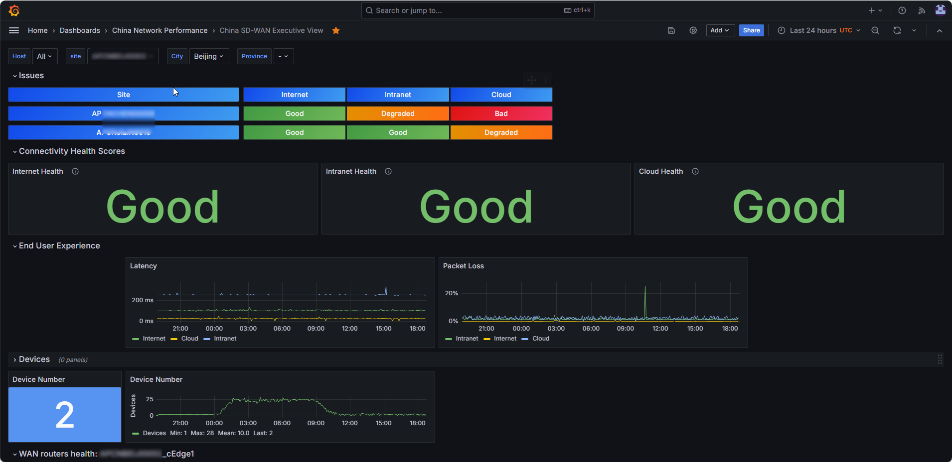
And it’s totally awesome if I do say so. I want to focus on the section labelled Issues, where I learned a very helpful technique.
You see that section where it shows Good Good Good? That is the network health scoring for one particular site, Beijing in this case. It comes about by doing some math with the flux expression. A health number from 0 – 100 is calculated, then Value Mappings are used in the Stat visualization to convert the numbers into one of three words, Good, Degraded or Bad, and the word is colored green for Good, orange for Degraded and red for Bad. The result for a different site is displayed by choosing it in the Site drop-down list.
But the Issues section, which was the last sectionto be added, is dependent on those dynamic calculations which are done on each site. The target audience for this dashboard said it’s great and all, but can we provide in one screen a list of all sites currently experiencing degraded or bad network performance?? A reasonable enough ask, but how to do it in Grafana?? I was ready to give up and consign myself to pre-calculating all those health scors for all sites on a regular basis, and put that into a pipeline job which would hjave spit out the results to a new InfluxDB measurement. That would have been a lot of work, honestly. But some youngster (under 30) looked at my existing code and had a flux language fix for my dilemma in a working demo with a couple hours! Then I further refined his demo to make it look even better.
I’d say the main thing is to use a pivot on the data. With the pivot it can spit out only those sites with either degraded or bad health, put that into a hidden template variable which in turn can be used as an iterator to make my nice stat visualizations, similar to what I’ve done previously and shown in detail above.
Just to show the complexity of this template variable, here is how it is calculated. In the end I see did not need to use his pivot although it was a good technique to master.
import "date" // a superior mind figured out the hard stuff in this query
import "join"
startBaseline = date.add(d: -${baselineDelta}h, to: v.timeRangeStop) // eventually make this v,timeRangeStart !!!
stopBaseline = date.add(d: 24h, to: startBaseline)
startDelayed = date.add(d: -${timeRecent}s, to: v.timeRangeStart)
stopDelta = date.add(d: -${timeRecent}s, to: v.timeRangeStop)
abaseresults = from(bucket: "${bucket}")  // to get the average latency ascore. Note the site filter was removed
  |> range(start: startBaseline, stop: stopBaseline)
  |> filter(fn:(r) => r._measurement == "Agents")
  |> filter(fn:(r) => r._field == "latency")
  |> group(columns: ["SSID","ltype"])
  |> keep(columns:["_value", "SSID","ltype"])
  |> mean() // produces a single number
alastresults = from(bucket: "${bucket}")  // to get the average latency ascore
  |> range(start: stopDelta, stop: v.timeRangeStop)
  |> filter(fn:(r) => r._measurement == "Agents")
  |> filter(fn:(r) => r._field == "latency")
  |> group(columns: ["SSID","ltype"])
  |> keep(columns:["_value", "SSID","ltype"])
  |> mean() // produces a single number
bbaseresults = from(bucket: "${bucket}")  // to get the average latency ascore
  |> range(start: startBaseline, stop: stopBaseline)
  |> filter(fn:(r) => r._measurement == "Agents")
  |> filter(fn:(r) => r._field == "packet_loss")
  |> group(columns: ["SSID","ltype"])
  |> keep(columns:["_value", "SSID","ltype"])
  |> mean() // produces a single number
blastresults = from(bucket: "${bucket}")  // to get the average latency ascore
  |> range(start: stopDelta, stop: v.timeRangeStop)
  |> filter(fn:(r) => r._measurement == "Agents")
  |> filter(fn:(r) => r._field == "packet_loss")
  |> group(columns: ["SSID","ltype"])
  |> keep(columns:["_value", "SSID","ltype"])
  |> mean() // produces a single number
myjoin = join.left( // join abaseresults and alastresults into one stream. This is super difficult way to do things!
  left: abaseresults,
  right: alastresults,
  on: (l,r) => l.SSID == r.SSID and l.ltype == r.ltype,
  as: (l, r) => ({abase: l._value, alast: r._value, SSID: l.SSID, ltype: l.ltype  })
)
aresults = myjoin
 |> map(fn: (r) => ({r with ascore: if r.abase > ${aCutoff} then 100.0*(1.0 - ${aHighCoeff}*(r.alast - r.abase)/r.abase) else
    100.0*(1.0 - ${aLowCoeff}*(r.alast - r.abase)/r.abase) }))
myjoinb = join.left( // join bbaseresults and blastresults into one stream
  left: bbaseresults,
  right: blastresults,
  on: (l,r) => l.SSID == r.SSID and l.ltype == r.ltype,
  as: (l, r) => ({bbase: l._value, blast: r._value,  SSID: l.SSID ,ltype:l.ltype })
)
bresults = myjoinb
 |> map(fn: (r) => ({r with bscore: if r.blast < ${bCutoff} then 100.0 - ${bSimpleCoeff}*r.blast else 100.0*(1.0 - ${bLowCoeff}*(r.blast*${bHighCoeff} - r.bbase)/(r.bbase + 0.001)) })) // avoid / 0.0 !
ares2 = aresults
  |> keep(columns:["ascore","SSID","ltype"])
bres2 = bresults
  |> keep(columns:["bscore","SSID","ltype"])
myjoinc = join.left( // join ares2 and bres2 into one stream. This is super difficult way to do things!
  left: ares2,
  right: bres2,
  on: (l,r) => l.SSID == r.SSID and l.ltype == r.ltype,
  as: (l, r) => ({ascore: l.ascore, bscore: r.bscore, SSID:l.SSID, ltype: l.ltype})
)
finalresults = myjoinc
 |> map(fn: (r) => ({r with tmpfinal: (r.ascore + r.bscore)/2.0 }))
 |> map(fn: (r) => ({r with finalscore: if r.tmpfinal > 100.0 then 100 else if r.tmpfinal < 0.0 then 0 else int(v: r.tmpfinal) }))
// |> filter(fn:(r) => r.finalscore <= 93) // for debugging
  |> filter(fn:(r) => r.finalscore <= ${deg_thresh})
  |> group()
  |> keep(columns: ["SSID"])
  |> distinct(column: "SSID")
finalresults
Of course this refers to a bunch of pre-existing template variables, but that’s kind of obvious so no need to define all of them in detail.
Just to mention it, the formula compares the current value for latency against the value as determined by a baseline taken as the average for this same day one week ago. Similarly for the packet loss. Those two numbes are combined for a composite score.
The latency and packet loss values are taken from an influxdb measurement which itself is fed by a pipeline job which uses the ThousandEyes api to get those values from our Thousandeyes enterprise agents.
Code re-use? Forget about it! This same formula has to be re-entered in other sections of my dashboard.
A word on RegEx
It should be easy, but I’ve had a hard time with it. Here, lately, is my syntax which is working for me. It’s changed from the examples above (note the regexp.compile):
import "regexp"
RegionRegex = regexp.compile(v: "^" + "${Region}") // just pick up sites from chosen region
from(bucket: "${bucket}")
|> range (start: -2d)
|> filter(fn:(r) =>
 r._measurement == "SSID" and
 r.SSID =~ RegionRegex)
|> keep(columns:["SSID"])
Repeating myself
Switching between regular and Tables view is essential to know what the heck is going on. A larger monitor really helped as well – I never really used one until Grafana more-or-less required it of me! Adding fake extra columns to a table can be really useful and the only way to do certain things, and it’s really not hard once you know how. When you’re stuck, figure a way to reduce your query to its essence and test it within query explorer, perhaps defining a few of your variables by hand at the top (which is time-cnosuming but sometimes necessary).
How to dump data into a CSV
If you mouse over a visualization and click on the three dots, choose Inspect > Data. You are given the option to save as CSV.
However, for my multiple time series there seems to be a bug and it arbitrarily picks just one of the time series and does not permit to select the other time series. I reproduced this on play.grafana.org. So I formally reported the bug to the github site. They fixed it in v 10.1.2 (release date 9/18/23)! My experience was good, meaning, they did not chew me out for not being an insider with intricate knowledge of OSS development protocol. Furthermore, it works better than I guess it did in the past. I read about limits to the number of data points you could save this way, maybe 500. But I tested with up to 2600 data points and got all of them into a CSV file. So maybe the upper limit is the limit of the number of points you can display on a graph (which I forget)?
Invalid: error @8:6 – 8:13 record is missing label substrings
If I try to use the strings function with importing it I get a pretty obvious error undefined idetifier strings with the row number and column numbers. But If I did include strings and then use the wrong function, the error is more subtle. I was referring to substrings, not substring, and got the error in the header.
Forget to import join?
Well, then the error might really throw you. I get:
invalid: error @42:10-42:14: expected { A with left: ( as: (l: {B with _value: C}, r: {D with _value: E}) => {holiday_flag: E, _value: C}, left: stream[F], on: (l: {G with day: H}, r: {I with day: J}) => bool, right: stream[K], ) => C, } (record) but found (<-tables: L, ?method: string, ?on: [string]) => stream[M] (function)
Not tremendously obvious and I almost gave up. Then I saw I had forgotten to do an import “join”! It’s hard to complain when the error reporting is otherwise quite good.
All time series have disappeared except the one you clicked on
This is not well documented. It’s kind of sort of a bug. Say you are displaying multiple time series with a legend. All good in the beginning. Then you click on the legend key to see just one time series by itself. All good. Then you work on the dashboard, save it, etc and after that, every single time you display it only that one time series displays even though you didn’t specify to save current variables. You can click on other time series in other time series, but by default they’re all hidden.
This happened to me. I had created a series override. Well, clicking on a key in the legend creates a second override! So once I saved my work I was doomed. Just deleted the unwatned override and voila, all will behave as desired once again!
Your stat visualization shows a bunch of numbers in a single square, not one number per square
I lost quite some time on this one. To get those individual little squares, you have to set your color mode to Background Gradient! Really. Try it.
Is your visualization showing too many time series?
After I’d been away from it for a month and forgot everything, I found I was getting more time series with my latest query than I wanted to display. The measurement had multiple fields, which is the key takeaway here. Fields are not columns and cannot simply be dropped. And I didn’t have a filter limiting the fields. To show only the fields you want you need to match your field names explicitly in your filter function. For my latest that looks like this:
|> filter(fn:(r) => r._field == "available_bw_mbps" or r._field == "capacity")
Your key:value template variables just output a string as key:value
Though it is counterintuitive, to get key:value variables to work you need to put a space before and after the colon! Go figure. E.g., China : APCN, EU : EU
Flux: learn to test units
You know how I created intermediate tables along the way? Any of them could have errors. So a way to do unit testing is to comment out the end table – 3values in this case – and put one of the intermediate tables such as data, or holidays, or myjoin or meanTbl. You basically better test them all to be really sure. And just use the Tables view to look at it.
And learn to hit Refresh frequently as you enter your Flux language query.
And use Data Explorer
I also used the Data Explorer to test things in isolation. But then I had to add some lines on top to assign values to missing template variables. But I found this approach invaluable when I was developing new features, so practice getting good at it.
Time series visualization represents an approximation
I was wondering why my data recorded at 15:05:05 had one value, and the time series visualization showed a completely different value for 15:05. It can only be that time series aggregates the data into time windows. So the point recorded on 15:05 (five minute time window) was actually taken from the data it received at 15:00:04! And if you export the data from the visualization you get that same approximate, or more properly aggregated, data, not the actual data points.
Multiple y axes
Yes, you can do it. use overrides on one of the variables. Then specify placement -> right and units -> whatever you like.
How to get mouse to display multiple series values, not just one
This can also be done! Select Tooltip mode All. This is normally the setting you want so use this tip often!
How to suppress displaying a time series with no data
This is now available with overrides. Choose Fields with Values > All Nulls > override property: Series: hide in area > click Tooltip, Viz, legend
Similarly if you want to not draw a time series with all zeros just choose Fields with Values all Zeros.
How to suppress the decimal in time series for numbers less than 100
In a time series viz standard options, Decimals is normally set to auto and will display 72.0 when you’re only inputting whole numbers! Change it to 0 and you will see 72.
Time series displays lines sometimes and individual dots other times
In the Graph styles section, below Line style: Solid, there is Connect null values. Choose Always instead of the default value Never.
InfluxDB tips for InfluxDB 3.0 serverless
You can easily extend your measurement design and add additional fields and tags to it even after you’ve started using it, which is cool.
However, once you fill a measurement with any amount of data, and then realize you made a mistake with the data type of one of your fields, it’s too late! As far as I know there’s no fixing it and you just have to start over with a new measurement (it happened to me).
The supported data types of a field are:
- Integer
- Unsigned integer
- Float
- String
- Boolean
Timeouts writing to InfluxDB cloud
I kept getting timeouts once a day writing data to Influxdb in the cloud. Examine the retries definition and how it is used in influx_modules.py in the feed_influx section of this post above. I’m not sure why it works, but ever since I threw that in there (a week ago) I haven’t had a timeout error.
Complaints
I am not comfortable with the flux query documentation. Nor the Grafana documentation for that matter. They both give you a taste of what you need, without many details or examples. For instance it looks like there are multiple syntaxes available to you using flux. I just pragmatically developed what works.
Conclusion
Well, this statred as amateur hour for InfluxDB and Grafana. But even amateurs can produce decent results if the tools are adequate. And that’s the case here. The results I am producing were “good enough” for our purposes – internal usage – to begin with, and they’ve only gotten better as I honed my skills.
I am content if no one reads this and it only serves as my own documentation. But perhaps it will help someone facing similar issues. Unfortunately one of the challenges is asking a good question to a search engine when you’re a newbie and haven’t mastered the concepts.
But without too too much effort I was able to master enough Grafana to create something that will probably be useful to our vendor management team. Grafana is fun and powerful. There is a slight lack of examples and the documentation is a wee bit sparse. InfluxDB seems to be a good back-end database for Grafana to use. The flux query language, while still obscure to me, was sufficiently powerful enough for me to get my basic goals accomplished.
References and related
I developed a blurring program in python which I used to present most of these imaages.
Lots and lots of examples are provided at https://play.grafana.com, and the best thing is that you can inspect and change stuff. Not sure how they do that…